ScaleX
ScaleX extends Manhattan Scale WMS with customisable dashboards, KPI tracking, announcements, internal messaging, and granular permission management — all embedded directly within the Manhattan interface.
Core Modules
Dashboard
Drag-and-drop pages with KPI widgets — Summary, Forecast, Gap Verification, Inactivities, Top & Bottom Performers.
Announcements
Role-based announcements targeted to specific pages or displayed globally.
Messaging
Internal messaging with file attachments for direct user-to-user communication.
Configuration
Activity & Metrics management, user permissions, role management, and personal preferences.
How It All Connects
All modules share a unified authentication system — Manhattan handles login and passes a session token automatically. A background Data Sync service continuously copies transactions, users, and metrics from WMS into ScaleX's database. A granular permission system controls access to every feature — enforced at the API level through roles and individual permissions.
Questions or feedback? contact@scalex.help
Authentication & Embedding
How ScaleX integrates with Manhattan WMS and handles user sessions.
ScaleX Dashboard runs inside the Manhattan WMS UI as an embedded iframe. Users open it from Manhattan — there is no separate login or URL to remember. Manhattan handles the authentication and passes a session token to ScaleX automatically.
Token Delivery
When ScaleX loads inside the iframe, it performs a handshake with the parent Manhattan page. Manhattan reads the current authentication token and sends it to ScaleX via a postMessage. ScaleX stores the token locally and attaches it to every API request.
Validation
On each API request, the ScaleX backend checks the token against its own database. If a matching user is found, the request is authorised immediately — no external call is needed. If the token is not recognised, the backend validates it against the Manhattan Scale API to retrieve the username, then stores the mapping for future requests.
Automatic Token Refresh
Manhattan monitors its own authentication token. When the token is refreshed by WMS, Manhattan automatically sends the updated token to the ScaleX iframe. ScaleX stores the new token and re-validates on the next request — no user action required.
Token Expiration
ScaleX automatically expires stored tokens after a configurable period of inactivity. Each time a token is received or refreshed, a timestamp is recorded. The background sync service periodically checks for tokens that have exceeded the configured lifetime and clears them from the database. On the next request, the token is no longer recognised locally, so the backend re-validates it against the Manhattan Scale API — the process is fully automatic and transparent to the user.
If validation fails (expired token, server unreachable, network issue), ScaleX shows an error screen with the option to close the window.
Data Sync
Background service that keeps ScaleX data current with Manhattan WMS.
ScaleX does not read directly from the Manhattan WMS database in real time. Instead, a background sync service periodically copies relevant data from WMS into ScaleX's own database. This ensures fast dashboard queries without impacting WMS performance.
Sync Cycle
A hosted background service runs continuously while the application is active. It performs a sync cycle at a configurable interval (default: every 5 minutes). The interval and enabled/disabled state are configurable. Each cycle performs:
Sync Transactions — fetches new WMS transactions since the last sync (using a watermark/timestamp). Inserts new transactions and runs activity matching to assign each transaction to the appropriate activity based on Filter SQL rules. Two follow-up steps run automatically as part of this stage:
- Absence auto-cancellation — if newly synced transactions overlap a previously recorded absence, that absence is automatically shortened or removed so the timeline reflects the actual work that took place.
- Stale auto-resolution cleanup — auto-resolved gap segments inherit their activity code from the preceding transaction. When activity matching changes (e.g. a Filter SQL edit or priority shift makes a different activity win), any auto-resolved segment whose inherited code no longer matches the new primary code is deleted; the timeline rebuilds it on the next render with the correct code.
Sync Users — imports the current list of active WMS users. Keeps the user list up to date for user selectors and permission management.
Sync Metrics — pulls daily metric values from WMS source tables as defined in Metrics Management. These feed the Summary Widget's custom metric charts and the Daily Breakdown's processed/outstanding metric views.
Announcements
Role-based announcements for broadcasting information to warehouse staff.
Managed in the Announcements page. Announcements let managers publish messages visible to specific users, or the entire warehouse — optionally restricted to a particular page within the application.
Targeting
- User targeting — target a specific user by username, or check All users to broadcast to broadcast to everyone.
- Page targeting — restrict the announcement to a specific page (by pathname), or check All pages to display it globally across the application.
Scheduling
Every announcement has a Show From and Show To date and time. The system automatically calculates the current status:
| Status | Condition | Meaning |
|---|---|---|
| Active | Current time is between Show From and Show To | Visible to targeted users right now. |
| Due | Current time is before Show From | Scheduled but not yet visible. |
| Expired | Current time is after Show To | No longer displayed to users. |
Announcement Properties
/scale/), or "All" for every page.Management
- Create — fill in content, targeting, and schedule. The announcement becomes visible to matching users as soon as the Show From time arrives.
- Edit — modify content, targeting, or schedule at any time.
- Copy — duplicate an existing announcement as a template for a new one.
- Delete — remove a single announcement, or select multiple and delete in bulk.
Messaging
Internal communication between ScaleX users and WMS feedback from warehouse staff.
The messaging module provides two-way communication: managers can send messages to warehouse users from ScaleX, and warehouse users can send feedback directly from the Manhattan WMS interface.
Views
- Inbox — received messages, including feedback sent by warehouse users from WMS. Unread messages are highlighted. Click a message to read it, reply, or delete it.
- Sent — messages you have sent. You can review, edit, or delete sent messages.
- Compose — create and send new messages to one or more recipients.
Composing Messages
- Recipient selector — a searchable tags input with autocomplete. Type a username to find it, or click the down arrow to browse the full list. Select multiple recipients to send the same message to all of them at once.
- Send to all — check this option to send the message to every user in the system.
- Message content — free-text message body.
- Image attachments — drag and drop or browse to attach images. Supported formats: PNG, JPG, GIF, WebP, BMP, SVG, TIFF. Maximum 10 MB per file.
After sending, a results summary shows how many messages were delivered successfully and flags any failures per recipient.
Replying & Threading
Each inbox message has a Reply button. Replies are linked to the original message, so both sides of the conversation are visible together. If a message has already been replied to, the button switches to Edit, letting you update your existing reply. Clearing the reply text and saving removes the reply entirely.
WMS Feedback
WMS users see a Send Feedback button in the top navigation bar of Manhattan WMS. It opens a dialog where they can send feedback about the WMS system to Logistics Systems Support, and optionally attach a screenshot.
Message Properties
Management
- Edit — modify the content of a sent message or a reply.
- Delete — remove a message permanently.
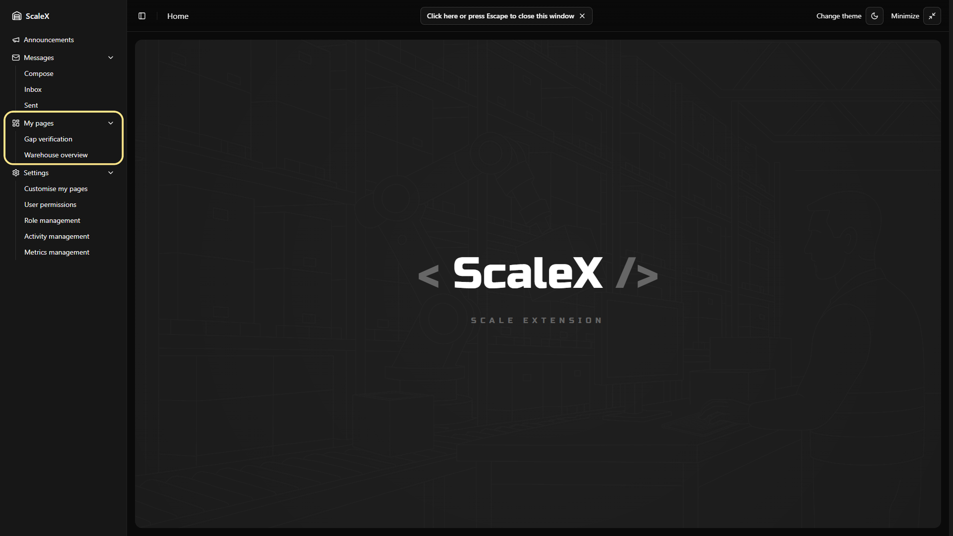
My Pages & Grid
Customisable dashboard pages with drag-and-drop widget layout.
My Pages is the dashboard system. Every user gets their own collection — fully customisable, personal, synced to server. No limit on page count.
Where My Pages Live in the UI
Pages appear in two places:
- Sidebar — under a collapsible "My pages" section. Each page is listed by name as a clickable link. The sidebar updates instantly when pages are added, renamed, or deleted.
- Settings → Customise My Pages — a dedicated management view where users create, rename, edit descriptions, and delete pages.
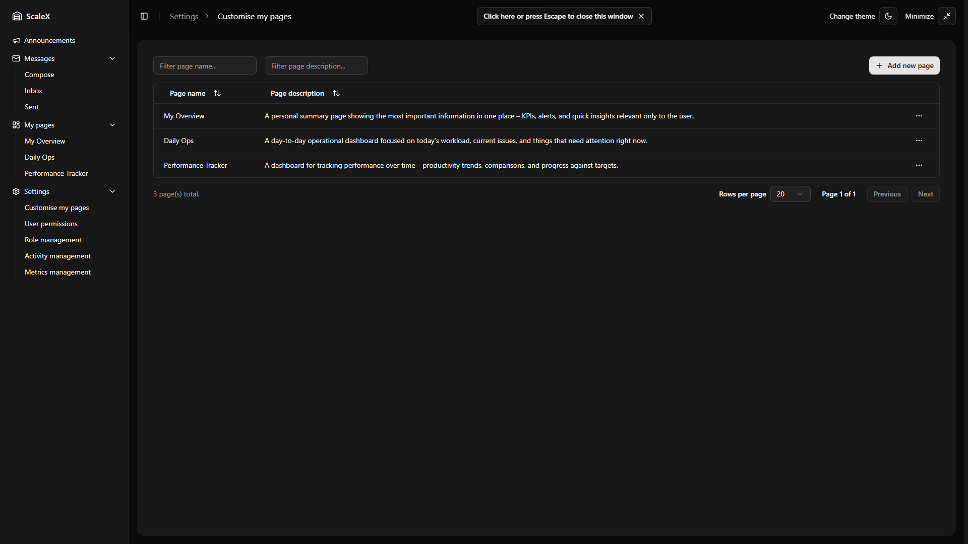
Creating a Page
In Customise my pages, click "Add new page". A dialog opens with two fields:
- Page name (required)
- Description (optional)
The name must be unique across the user's pages. On success, the page appears in the sidebar immediately and starts with an empty grid.
Editing & Deleting a Page
Each page has a "⋯" dropdown menu with "Edit page" and "Delete" options. Editing name or description never affects the widget layout. Deletion is immediate — the page, its widget layout, and all cached data are removed. Bulk delete is supported.
Edit Mode
Click the "Edit" button in the page header. The grid becomes interactive — widgets can be dragged, resized, added, and removed.
What you can do in edit mode:
- Move widgets — drag by the header to reposition. Other widgets shift automatically to avoid overlap.
- Resize widgets — drag the bottom-right corner handle. Each widget type has minimum size constraints.
- Add widgets — pick a type from the dropdown. The widget appears in the first available space with default size.
- Remove widgets — each widget has a remove button (×) visible in edit mode.
Saving & Discarding
Saving: Click "Done". The entire layout — every widget's position, size, type, colours, pagination settings, and filters — is saved to the browser instantly and synced to the server in the background. Saving is optimistic — the local cache updates immediately, and if the server is unreachable, the app continues working with cached data.
Discarding: Restores the layout to exactly how it was before entering edit mode. Nothing is saved.
Unsaved Changes Protection
Navigating away, pressing Escape, or closing the window while in edit mode triggers a confirmation dialog with three options: Save, Discard, or Cancel (stay and keep editing).
The Grid
The grid is 24 columns wide. Widgets snap to grid positions — no freeform placement. This ensures clean, aligned layouts.
- Widgets pack upward automatically — no empty gaps between rows.
- The grid expands when widgets are added and contracts when they are removed.
- Smooth animations on move and resize.
- On narrow screens (mobile), the grid switches to a single-column stacked layout. Desktop and mobile layouts are maintained independently.
Widget Types Available
Each page can contain any mix of these six widget types. Multiple instances of the same type are allowed.
| Widget Type | Purpose | Custom Colours |
|---|---|---|
| Forecast | Line chart — actual vs forecast performance over time | ✓ |
| Summary | Bar chart — performance, processed/custom metrics, headcount, or hours | ✓ |
| Longest Inactivities | Employee cards ranked by longest idle time | ✓ |
| Top/Bottom Performers | Ranking table by average performance % | — |
| Gap Verification | Full timeline verification tool with segment editing | ✓ |
| Employee Performance | Weekly performance grid with daily breakdowns, idle time, trends, and notes | — |
Widgets with colour controls let you customise chart colours, segment colours, or ranking colours — saved per widget as part of the layout.
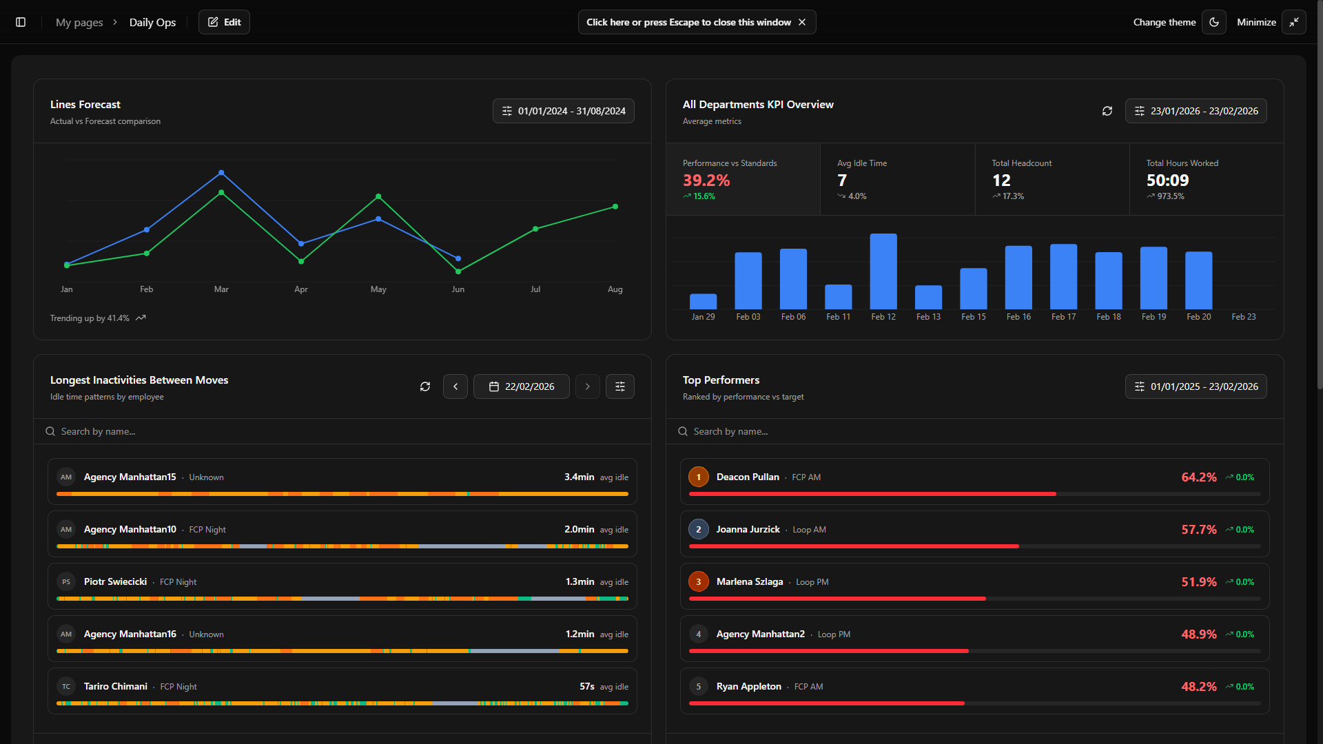
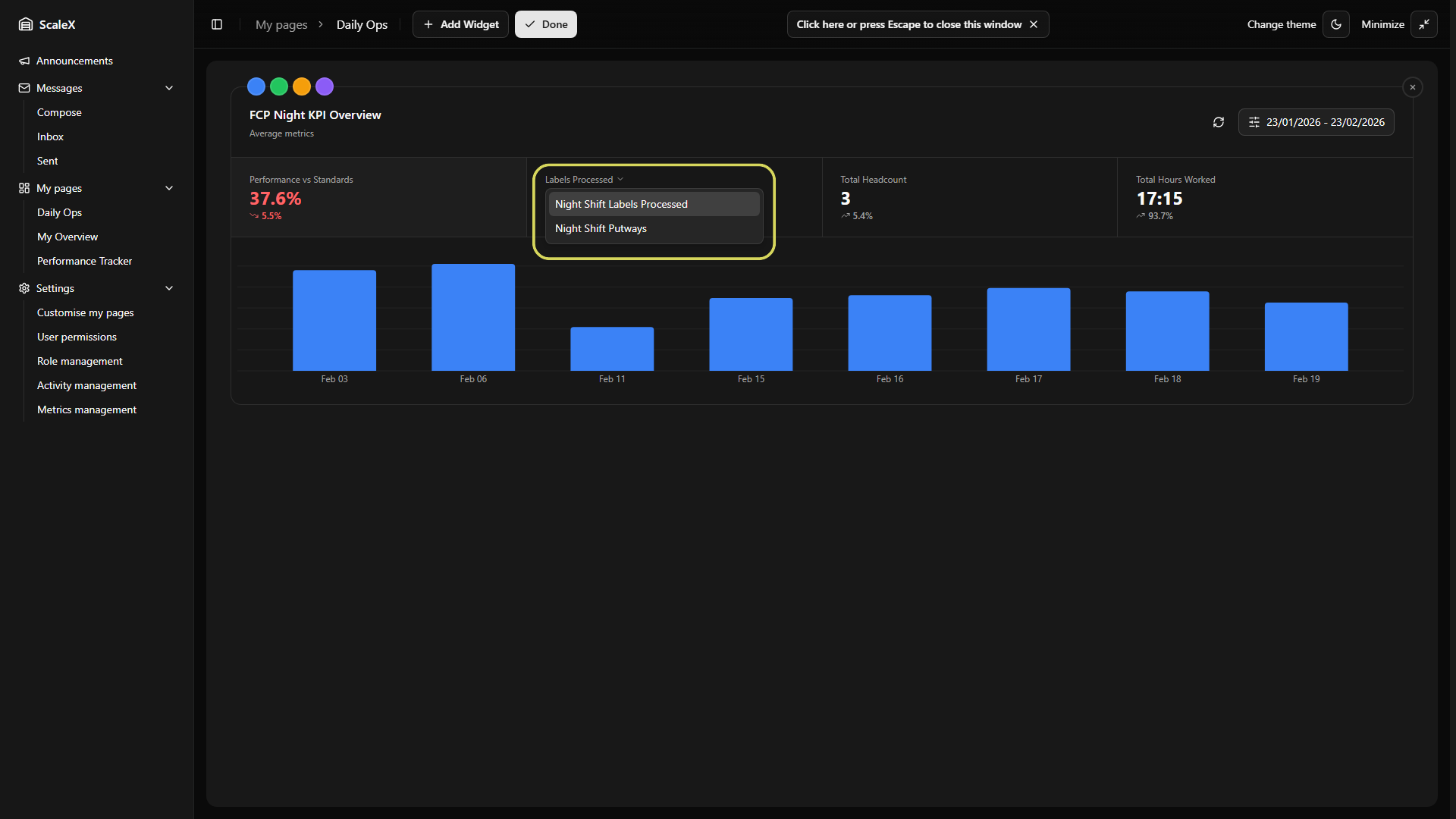
Summary Widget
The main KPI overview — cards, charts, and drill-down.
The Summary widget is the main KPI overview for the warehouse. It consists of a header with controls, four KPI summary cards, a bar chart, and a click-through to a detailed day breakdown.
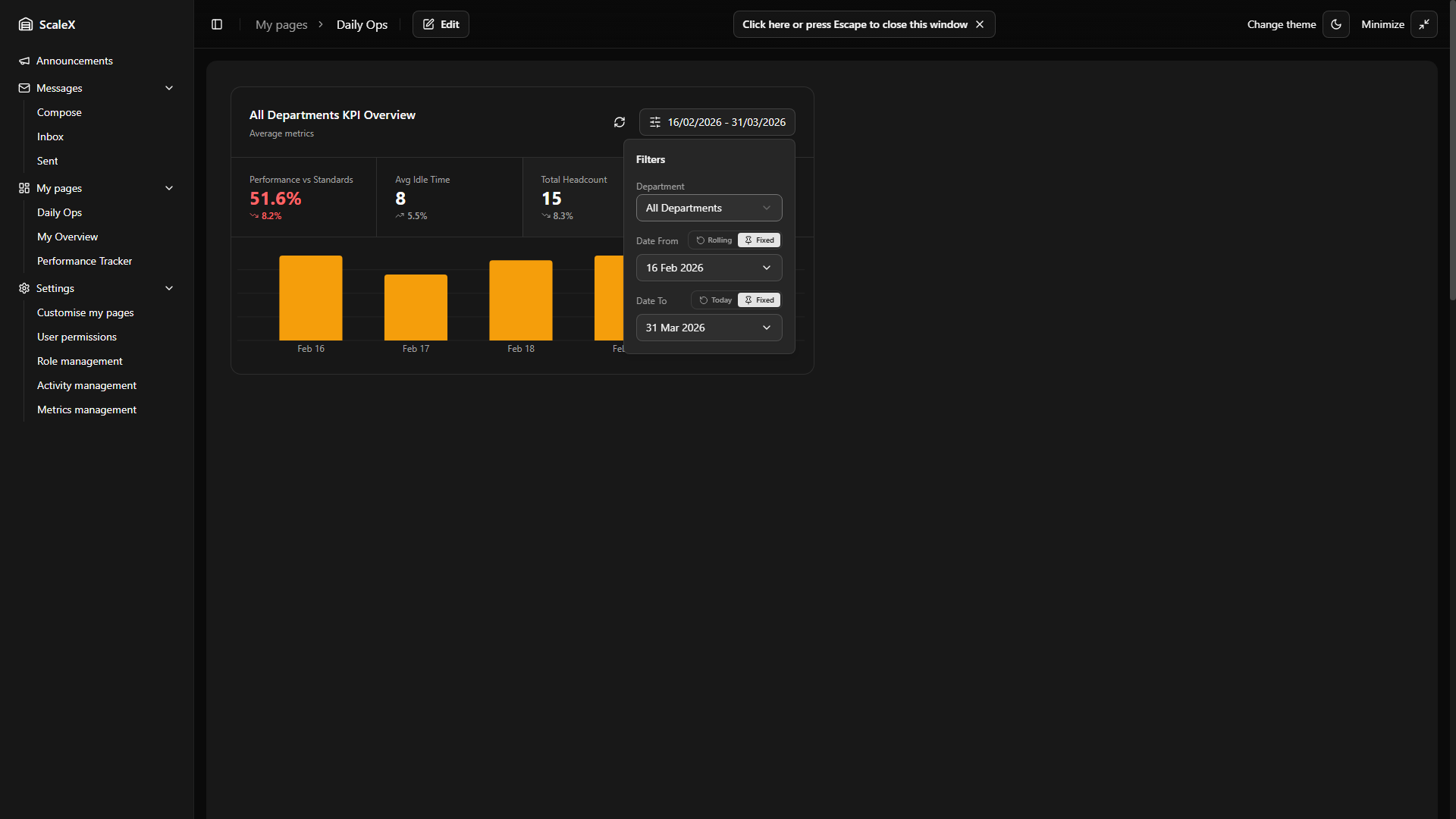
Header & Filters
The header shows a dynamic title (e.g., "All Departments KPI Overview" or the name of the selected department), a Refresh button to reload data on demand, and a Filters button.
The Filters popover contains:
- Department selector — choose "All Departments" or any specific department. Changing the department reloads all data and adjusts the available metrics.
Date range — each date field ("Date From" and "Date To") has a mode toggle:
- Rolling default — "Date From" is set as "Last N days" (default: 30). The start date recalculates automatically each day.
- Fixed — a calendar picker lets the user choose a specific date.
- Today default — "Date To" always resolves to today's date.
Fixed + Fixed — e.g. 1 Feb → 18 Feb. Always shows exactly that range regardless of the current date.
Fixed + Today — 1 Feb → today. On 24 Feb, this shows 1 Feb – 24 Feb. The next day it extends to 1 Feb – 25 Feb. Useful for tracking a period from a known start date (e.g. beginning of a project or month) up to the present.
KPI Summary Cards
Four KPI cards arranged in a row. Each shows the metric name, its average value over the selected date range, and a trend indicator (percentage change and up/down arrow). The active card is highlighted. Clicking a card switches the chart below to show that metric's data.
Trend arrows show whether performance is improving or declining — calculated by comparing the average of the first half of the selected date range against the second half.
| Card | Description |
|---|---|
| Performance vs Standards | Average performance %. Colour-coded performance thresholds. |
| Processed / Custom Metric | All Departments → Average Idle Time. Specific department → the currently selected custom metric. If the department has multiple "processed" metrics defined, a dropdown arrow appears on this card's label — clicking it opens a menu to switch between all available processed metrics. If only one metric exists, the label is static. |
| Total Headcount | Average daily headcount. |
| Total Hours Worked | Average daily hours. |
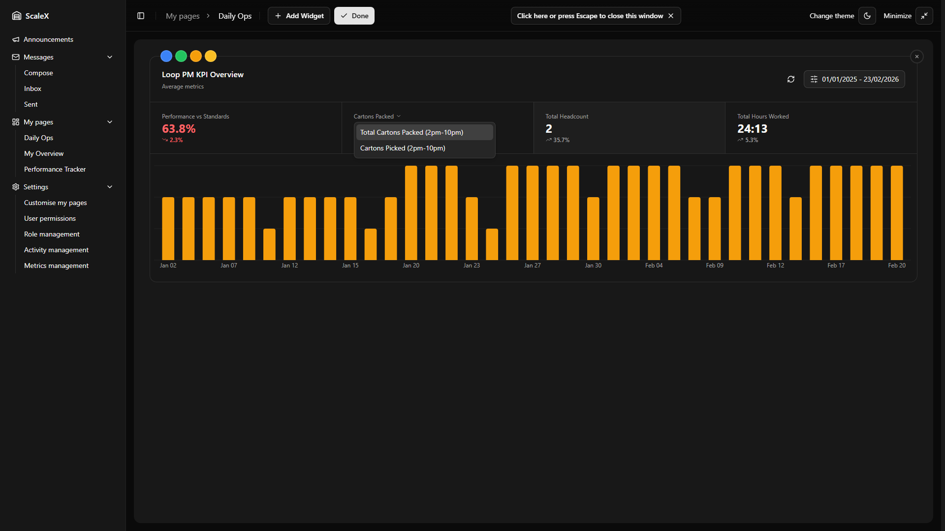
Bar Chart
Below the KPI cards, a bar chart displays daily values for whichever metric card is currently selected. Each bar represents one day. Hovering over a bar shows a tooltip with the exact date and value.
Clicking a bar opens the Daily Breakdown — a slide-out panel with a full breakdown of that specific day.
Filter Persistence
All filter selections — active chart tab, selected department, selected custom metric, date range settings (including mode and rolling days) — are persisted as part of the widget layout. They survive page refreshes and are saved when the user clicks "Done" in edit mode. Rolling dates re-compute automatically on each page load, so a "Last 30 days" filter always shows the latest 30 days without manual adjustment.
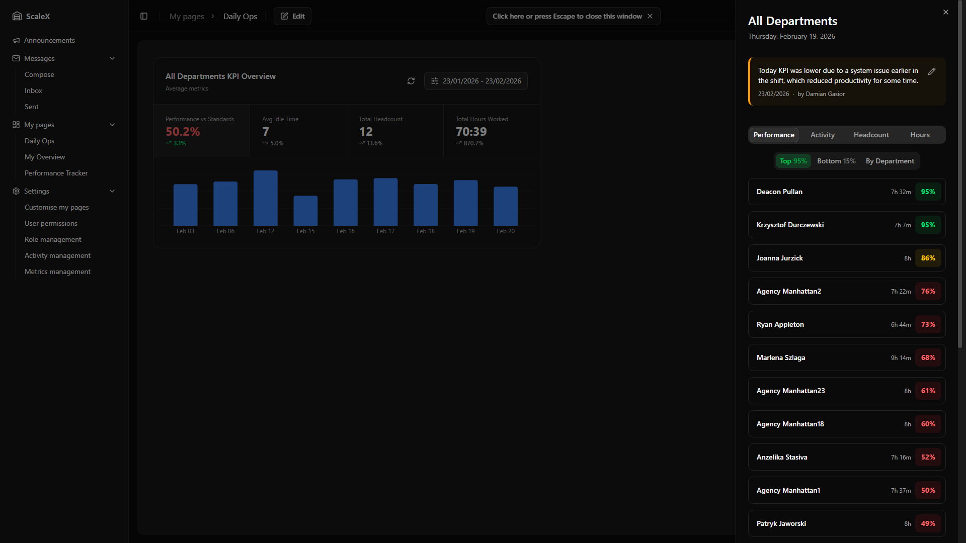
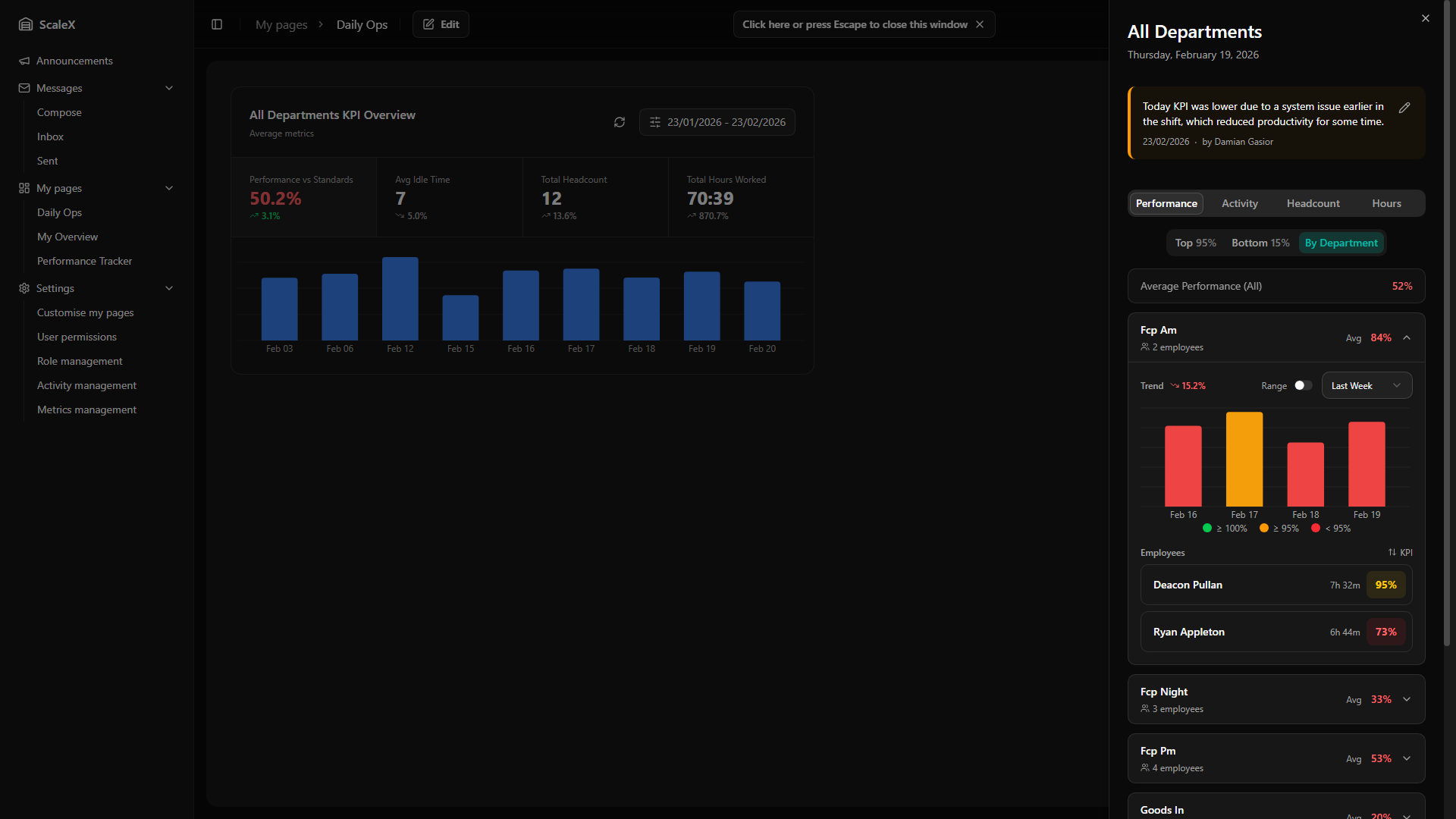
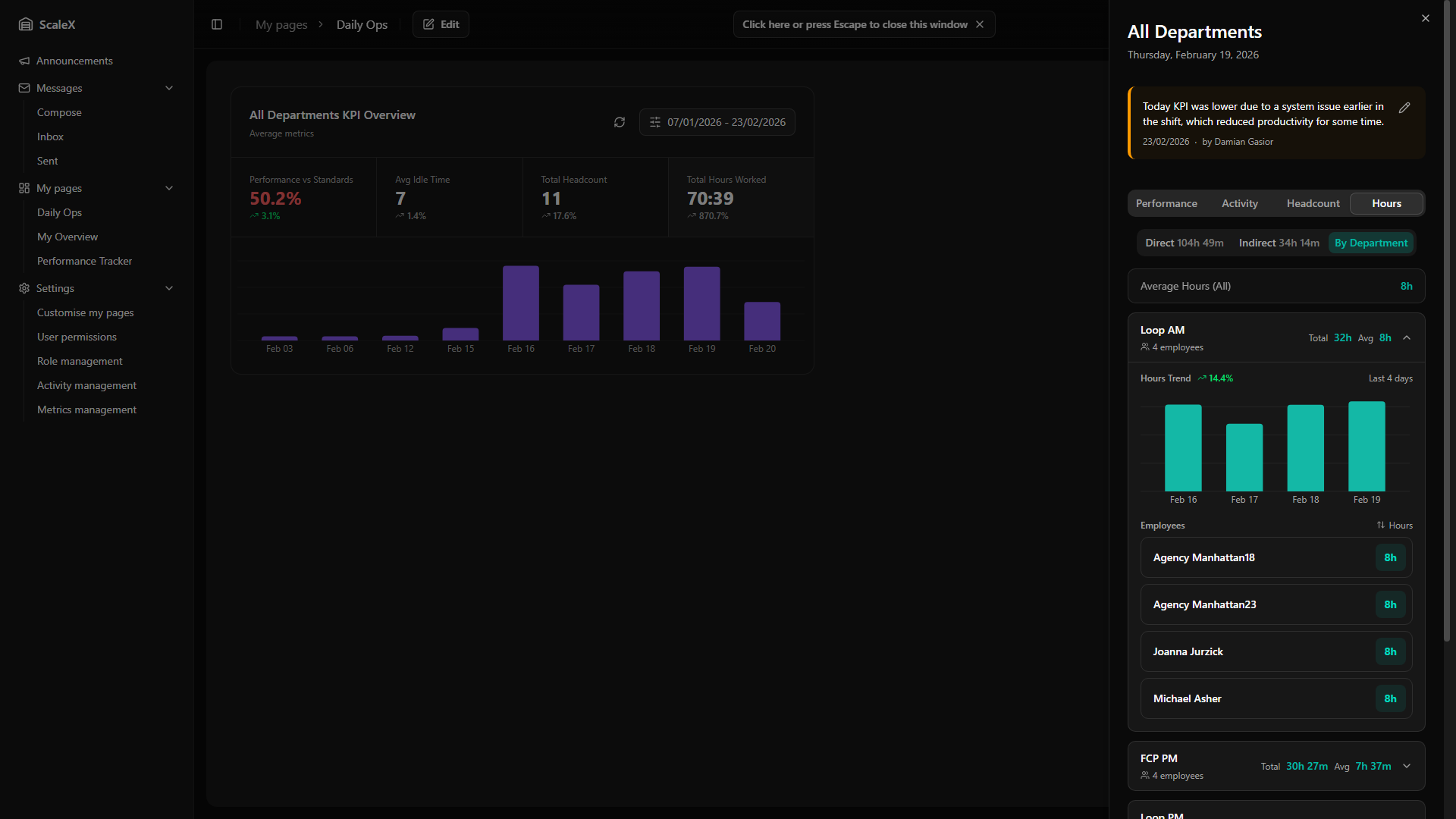
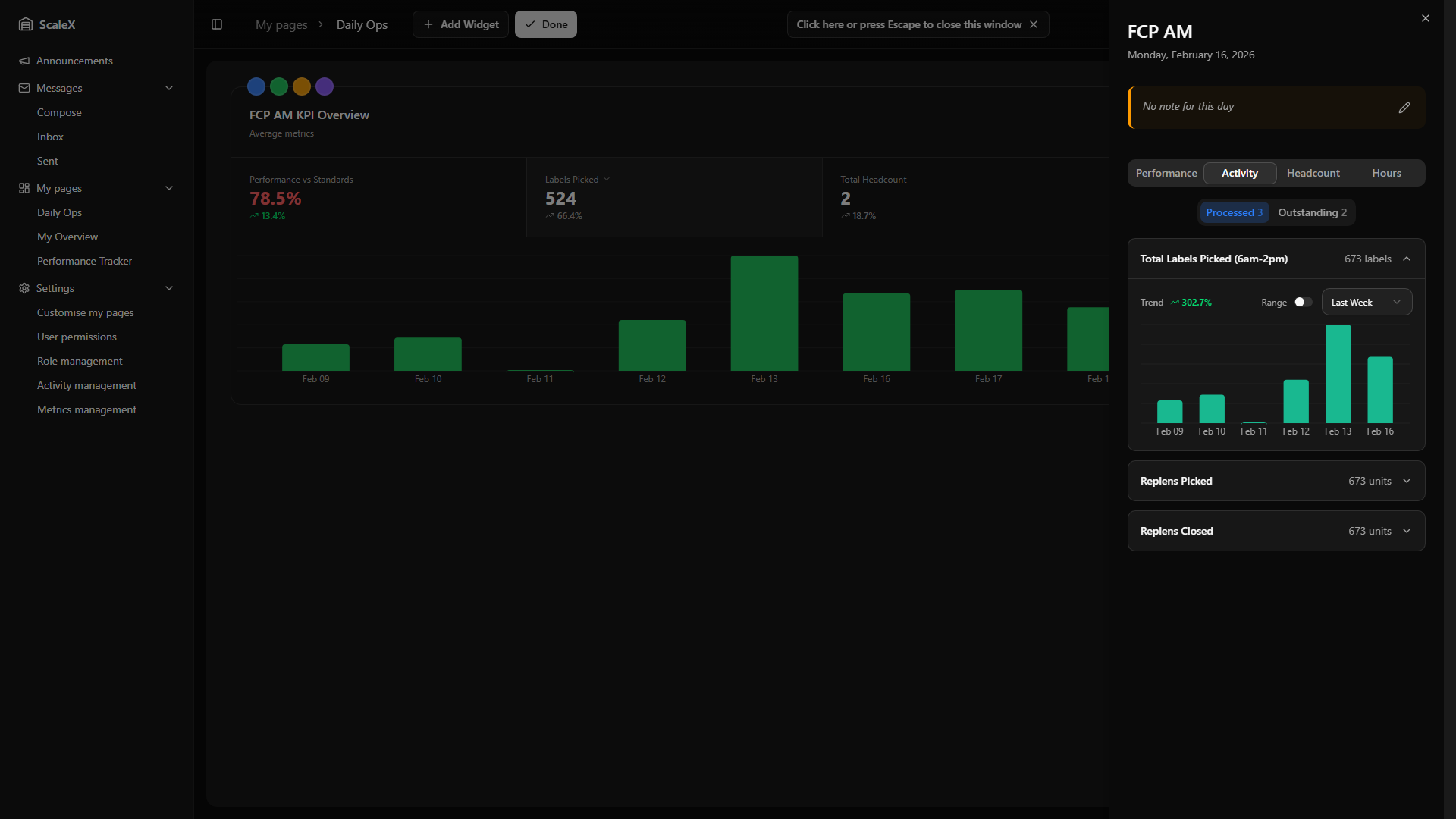
Daily Breakdown
Deep drill-down into all operational data for a single day.
The Daily Breakdown is a slide-out side panel that opens when clicking on a day bar in the Summary widget. It provides a deep drill-down into all operational data for a single day.
Header & Leader Note
The header shows the department name (or "All Departments") and the full formatted date (e.g., "Monday, 14 April 2025").
Below is a Leader Note section — a space for leaders to leave daily context notes (e.g., "Short-staffed due to training day"). If a note exists, it is displayed with the author's name and the date it was last updated. Leaders can click the edit icon to open a text editor where they can write or modify the note. Notes are saved per day and per department (or warehouse-wide if viewing All Departments), and editing is permission-based — only users assigned as leaders for the relevant department can edit.
Navigation Tabs
| Tab | Content |
|---|---|
| Performance | Employee list with performance %, sortable top/bottom, department grouping |
| Activity | Inactivities (All Depts) or Processed/Outstanding metrics (specific dept) |
| Headcount | Breakdown by status: Unverified, Working, Holiday, Absence |
| Hours | Direct hours, Indirect hours, By Department breakdown |
Performance Tab
Shows employees with performance data as clickable rows. Each row displays name, hours worked, and performance percentage — colour-coded performance thresholds. Clicking any employee row opens the Employee KPI Modal.
Sub-filters: Top (highest first — shows the highest performance value, e.g., "Top 112%"), Bottom (lowest first — shows the lowest value, e.g., "Bottom 62%"), and By Department (All Departments mode only). By Department groups employees into expandable department cards showing name, employee count, and average performance. Expanding a card reveals a history bar chart of daily performance (last 7 days by default, switchable to last month or a custom range), a trend indicator, and a sorted employee list within that department.
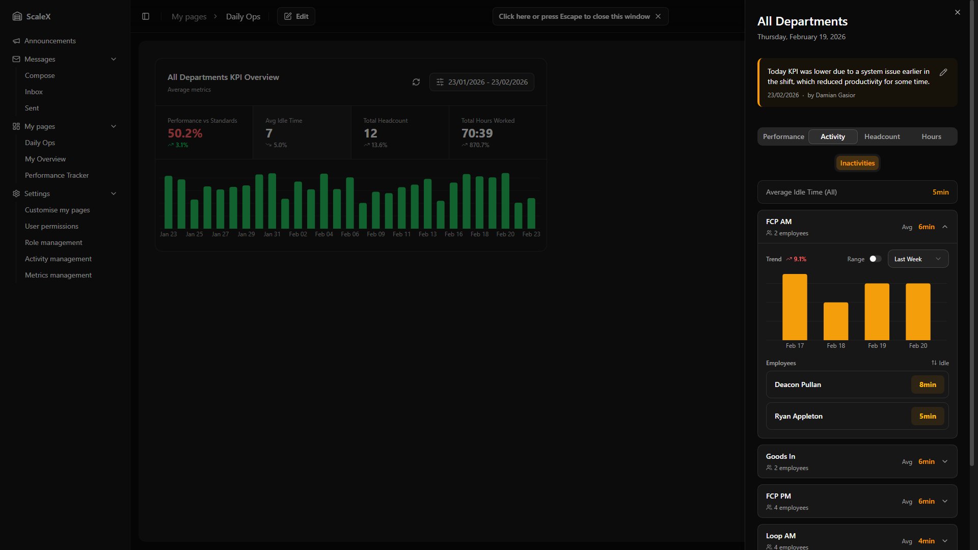
Activity Tab
All Departments — Inactivities view: Lists every department as an expandable card showing department name, employee count, and average idle time in minutes. Expanding a card reveals a trend indicator and percentage, a history bar chart of daily average idle time (last 7 days by default, switchable to last month or custom range), and a list of employees with their name and idle time. Employees can be sorted alphabetically or by idle time (ascending/descending). Clicking an employee opens the Employee KPI Modal.
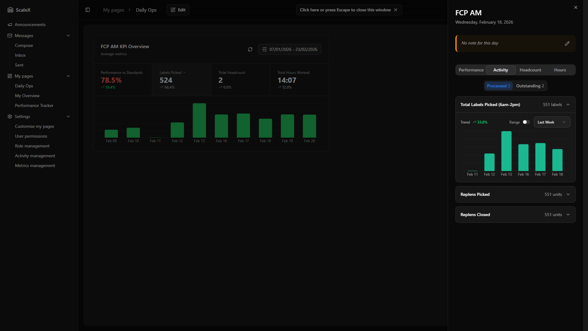
Specific Department — Processed/Outstanding Metrics: Two sub-filters with counts. Each metric is displayed as an expandable card showing the metric name and current daily value with unit. Expanding reveals a trend indicator — for "processed" metrics upward trends are green (positive), for "outstanding" metrics the logic is inverted (downward trends are green, as reducing outstanding work is good). A history bar chart shows daily values using the metric's configured colour, with the time range switchable between Last Week, Last Month, or a custom calendar range.
Headcount Tab
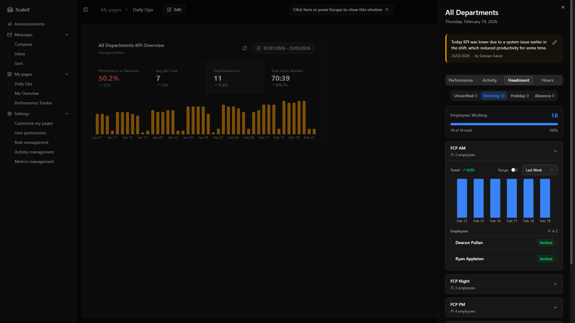
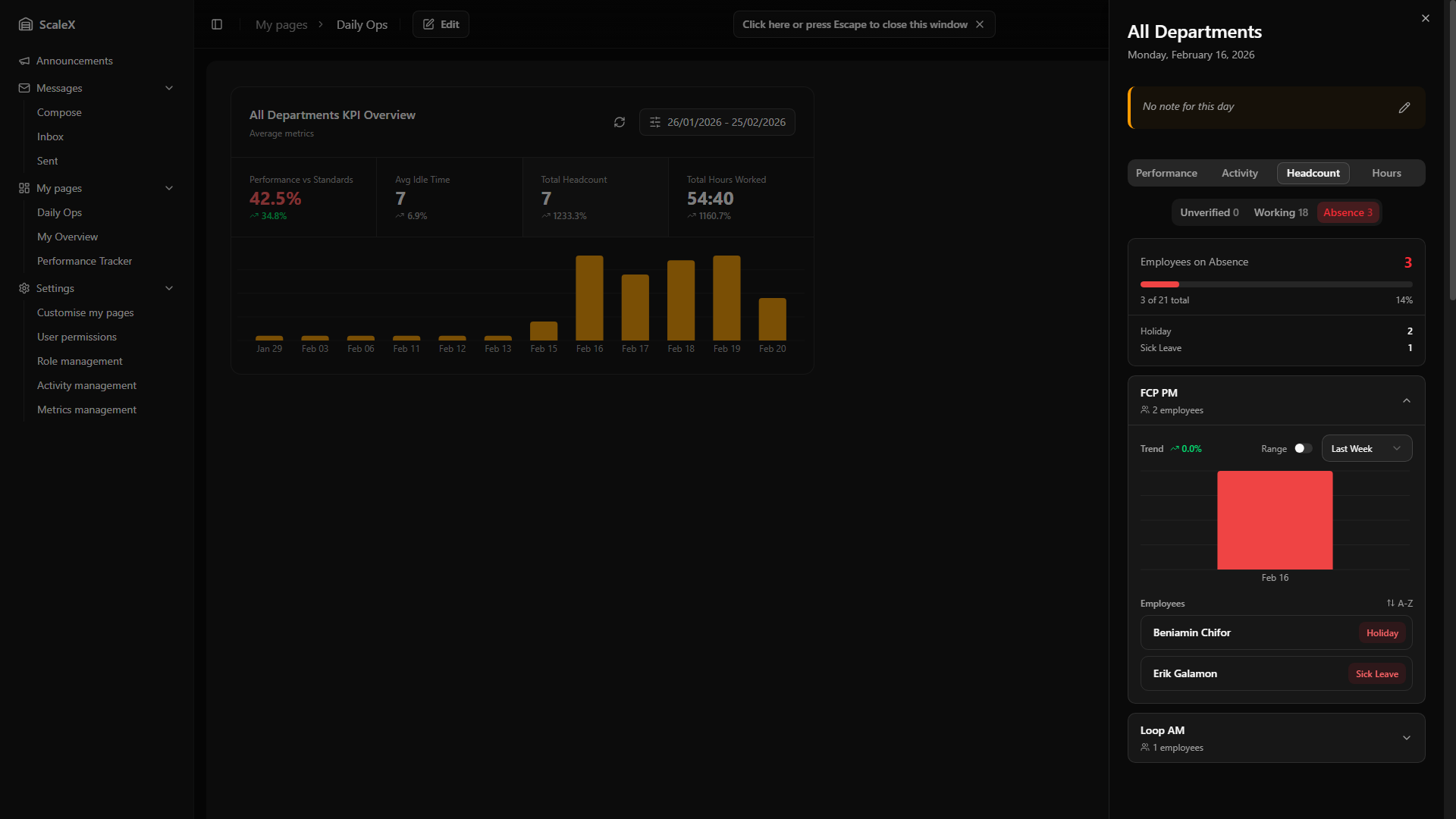
Shows the day's headcount broken down by employee status. Three sub-filters, each showing its count: Unverified employees with transactions whose timeline has not been verified, Working verified working employees, Absence employees on any type of absence (holiday, sick leave, etc.).
For Unverified and Working filters, departments are listed as expandable cards showing department name and employee count. Expanding a card reveals a trend indicator, a history bar chart of the daily count for that status (last week by default, switchable), and a list of individual employees sortable alphabetically or by verified/unverified status. Clicking an employee opens the Employee KPI Modal.
The Absence sub-tab includes a summary section at the top — titled "Employees on Absence" — that shows the total absence count and breaks it down by absence type (e.g., Holiday 2, Sick Leave 1). This gives an immediate overview of what types of absences make up the total. Below the summary, departments are listed as expandable cards. Each employee row within a department card displays the employee's name alongside their specific absence type (e.g., Holiday, Sick Leave), so leaders can see at a glance why each person is absent.
Hours Tab
Shows the day's hours breakdown. Three sub-filters: Direct (total direct hours), Indirect (total indirect hours), and By Department. A summary bar at the top of each filter shows the overall average (e.g., "Average Direct Hours (All)").
Direct and Indirect filters list activities as expandable cards. Each card shows the activity name, total hours, average hours per employee, and employee count. Expanding reveals a trend indicator, a history bar chart of daily hours for that activity, and an employee list showing each person's hours — sortable alphabetically or by hours. By Department lists departments with the same structure. Clicking an employee opens the Employee KPI Modal.
When viewing Direct or Indirect hours, an "Include auto-assigned gap time" toggle appears if any activities contain auto-assigned hours. The toggle is amber when active (default: on) and displays a "?" badge with a tooltip explaining "Gaps created when activity threshold is exceeded". When toggled off, the system subtracts auto-assigned gap hours from total hours, average hours per employee, employee-level hours, and history chart values — giving a view of only manually verified or transaction-based hours.
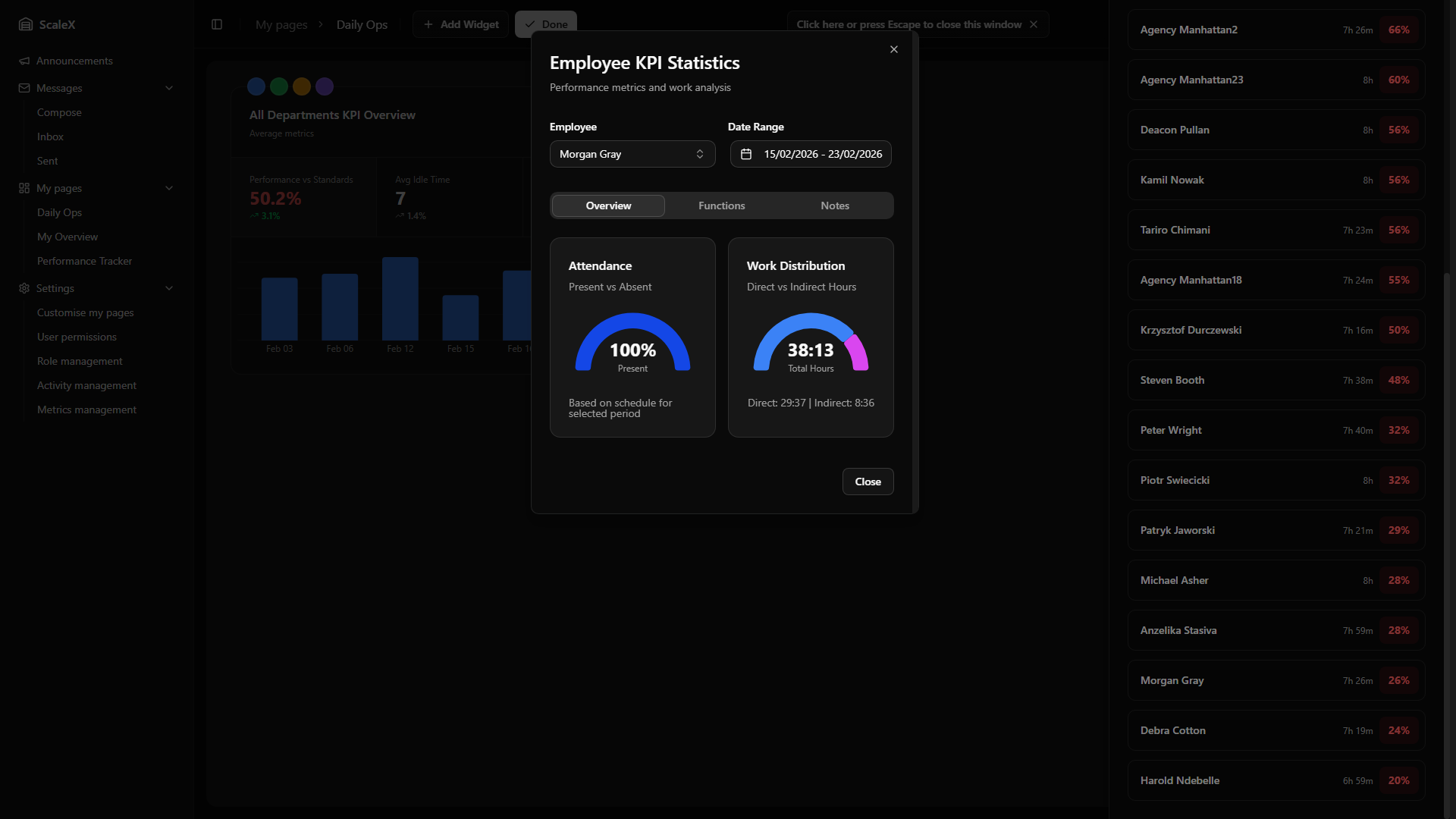
Employee KPI Modal
Comprehensive individual performance profile.
Opens when clicking on any employee name anywhere in the Daily Breakdown. Provides a comprehensive individual performance profile.
Header
Shows the employee's name, their department, and a date range selector. The default range is based on the context from which the modal was opened (typically anchored around the selected day). The user can change the date range to analyse a different period — all data in the modal updates accordingly. There is also an employee selector (searchable dropdown) to switch to a different employee without closing the modal.
Overview Tab
Two half-circle donut charts side by side:
- Attendance — a semicircular chart showing the percentage of scheduled time the employee was present vs absent.
- Work Distribution — a semicircular chart showing the split between Direct hours (blue) and Indirect hours (purple).
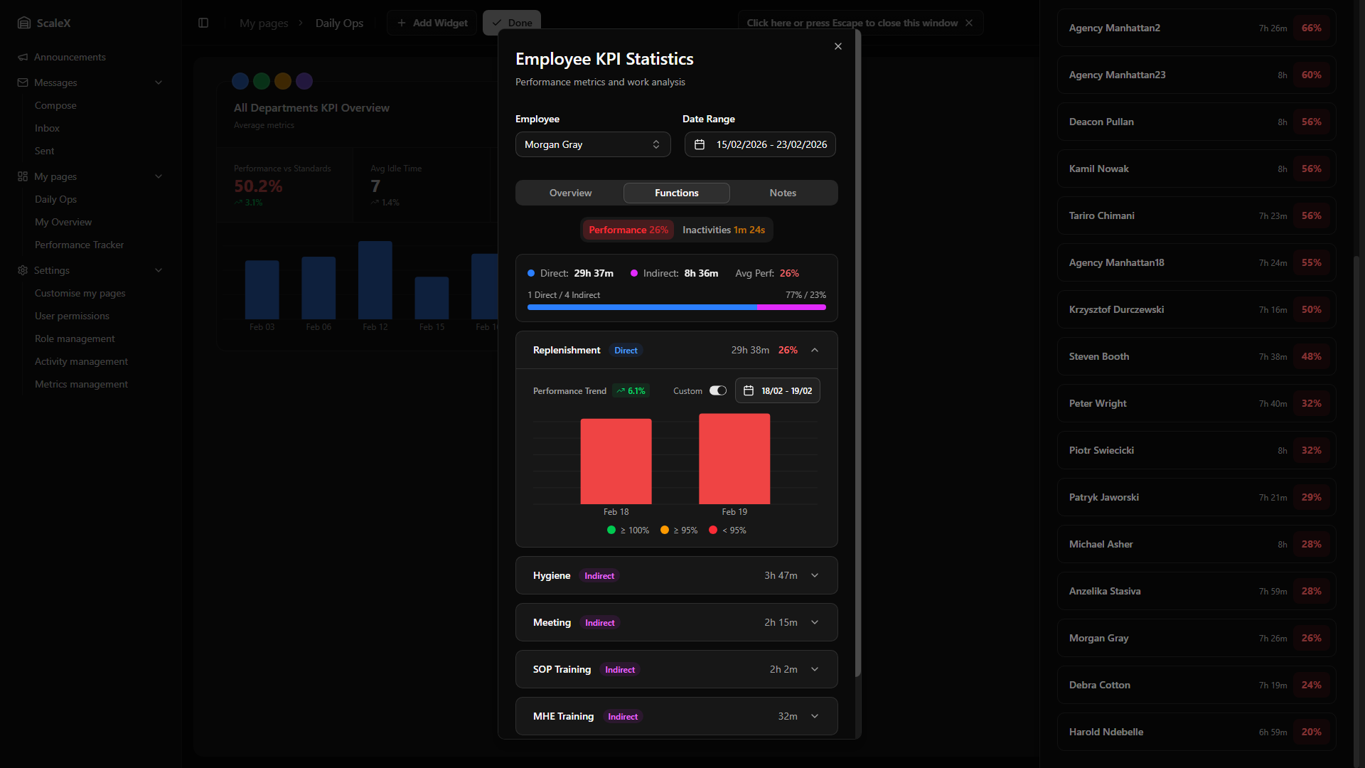
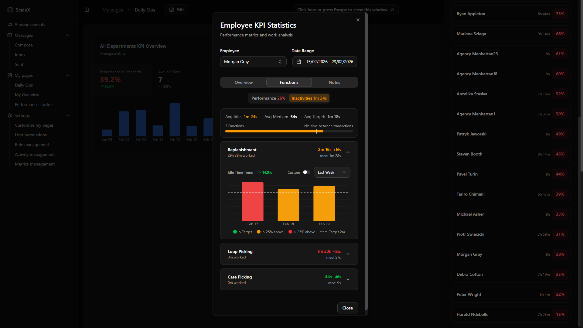
Functions Tab
The Functions tab has two sub-tabs selectable via pill-style buttons: Performance (showing the average performance percentage, colour-coded) and Idle Time (showing the average idle time, colour-coded against the target).
Performance sub-tab
A summary bar at the top shows: direct hours, indirect hours, the ratio between them (with a visual proportion bar), average performance percentage — colour-coded performance thresholds — and the count of direct vs indirect functions.
Below, each activity (function) the employee worked on is listed as an expandable card. Each card shows the activity name, whether it is direct or indirect, hours worked, and for direct activities a performance percentage and transaction count. If auto-assigned gap time was included, an amber indicator with the duration appears on the card.
Expanding a card reveals a period selector (Last Week or Last Month) and a Custom toggle that switches to a dual-month calendar date range picker. The daily bar chart uses stacked colour-coded bars — green for days meeting the target, amber for close, red for below — for direct activities, or single-colour bars for indirect activities. Below the chart, a trend indicator (arrow up/down with percentage change) shows whether performance is improving or declining over the selected period. A colour legend explains the threshold bands.
Inactivities sub-tab
A summary bar shows the employee's average idle time, median idle time, and idle target — with a visual progress bar where the coloured portion represents the average idle time and a dashed vertical line marks the target. Idle time is colour-coded: green if within target, amber if within 125% of target, red if above.
Each activity is listed with idle time statistics: average idle time, deviation from target (±Xm, colour-coded), and median idle time. Expanding a card reveals the same period selector and Custom date range toggle as the Performance sub-tab. The daily bar chart uses stacked colour-coded bars (green ≤ target, amber ≤ 125% of target, red > 125%) with a dashed target line drawn across the chart. A trend indicator shows whether idle time is improving (decreasing, green) or worsening (increasing, red). A colour legend with the three bands and the target line is shown below.
Notes Tab
A notes system for recording observations about an employee. Leaders can add notes with a type: positive, neutral, or negative. Adding and deleting notes is permission-based — notes can be deleted by the user who created them.
Filtering & Sorting
Four filter buttons at the top of the tab allow narrowing the list by note type: All, Positive, Neutral, or Negative. Each button displays a count badge showing how many notes exist for that type — e.g., "Positive 3". The active filter is visually highlighted and the list transitions smoothly when switching filters.
Next to the filters, a sort toggle switches between Newest first (default) and Oldest first order.
Adding a Note
Clicking "Add Note" reveals the note form with three fields:
- Date picker — calendar popup, defaults to today's date.
- Type selector — three toggle buttons: Positive (green check icon), Neutral (blue minus icon, selected by default), or Negative (red X icon).
- Note text — free-text area. The "Save Note" button is disabled until text is entered.
Note Display
Each note is rendered as a card with a coloured left border — green for positive, blue for neutral, red for negative — and a matching icon (thumbs up, notebook, or thumbs down). Below the note text, the date and creator name are displayed. A delete button (trash icon) appears on hover for notes the current user created.
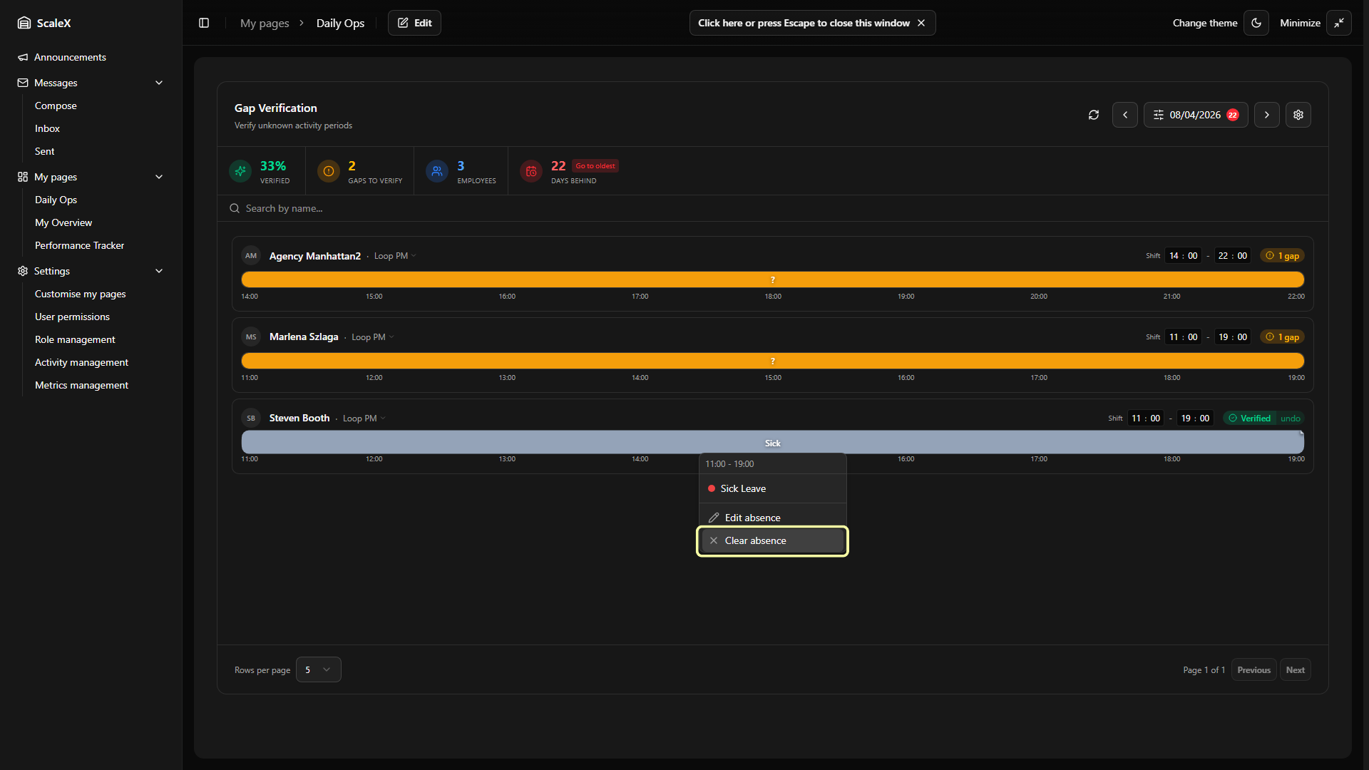
Gap Verification Widget
Account for every minute of employee shifts by resolving timeline gaps.
A full timeline-based tool for reviewing and verifying employee activity throughout their shift. Its purpose is to account for every minute of an employee's workday by identifying time periods where the system could not automatically recognise what the employee was doing (gaps) and allowing leaders to manually assign activities or absences to those periods.
Header Controls
- Refresh button — reloads all timeline data and pending days.
- Previous / Next day buttons — navigate one day backward or forward.
- Filters button — opens the filters popover. Displays the currently selected date and a pending days badge — a small circle showing how many days still have unresolved gaps (red if pending, grey if zero).
- Settings button — opens the gap settings popover.
- Visibility button (eye icon) — opens a popover with two independent toggles: Stats bar (show or hide the statistics bar below the header) and Search bar (show or hide the employee name search). Both toggles are persisted as part of the widget layout. Hiding the search bar also clears the current search query.
Filters Popover
- Show only with gaps toggle (default: on) — when enabled, only employees with at least one unresolved gap are displayed.
- Show only with transactions toggle (default: on) — when disabled, all employees in the department appear, useful for identifying no-shows.
- Department selector — "All Departments", a specific department, or "Unassigned" (employees not yet assigned to any department).
- Date picker — a calendar where days with unresolved gaps are marked with a red dot below the day number, making it easy to spot which days need attention.
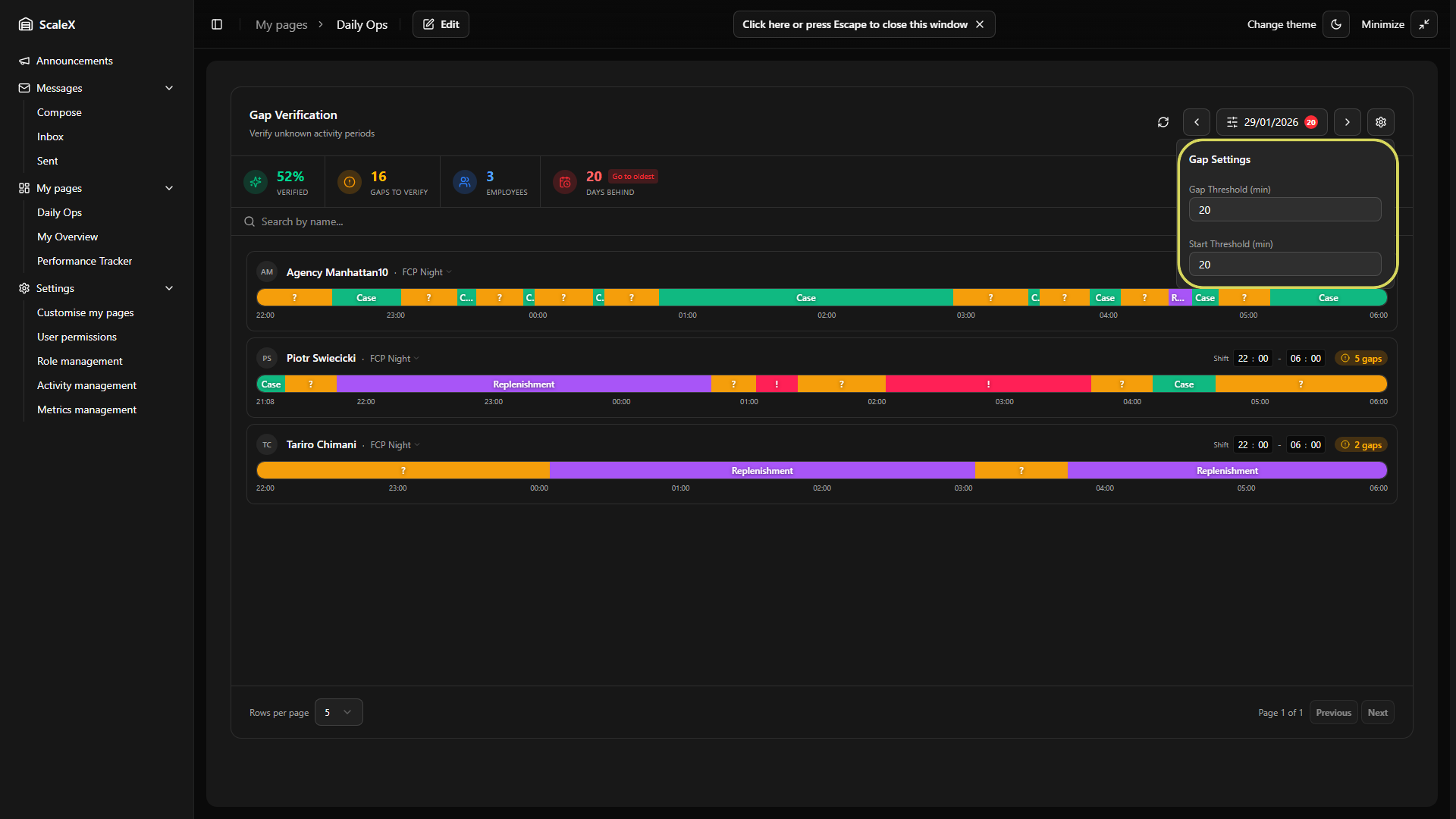
Gap Settings
Gap Threshold (default: 15 minutes)
Controls how the system distinguishes between normal pauses in work and genuine idle periods that need attention. When an employee finishes one transaction, the system starts watching the clock:
- Next transaction arrives before the threshold — the time between the two transactions is treated as continuous work. KPI for the previous activity is calculated all the way up to the moment the next transaction begins. No gap is created.
- Next transaction arrives after the threshold — the system creates a gap segment covering the entire period from the last transaction to the next one. This gap appears on the timeline as an amber "?" segment that a leader must review and assign.
Start Threshold (default: 10 minutes)
Controls how the system handles the beginning of a shift before the employee's first transaction.
- First transaction within the threshold — the system assumes the employee was working from the beginning of their shift. KPI for that first activity is calculated starting from the shift start time, not from the first transaction.
- First transaction after the threshold — the system creates a gap from the shift start to the first transaction. This gap must be assigned by a leader.
Overtime Buffer (default: 4 hours)
Controls how far past the shift end the system looks for additional activity when no manual overtime is set. If an employee keeps working after their shift, transactions detected within this buffer window are automatically pulled into the timeline. Setting it to zero disables the buffer entirely — only explicit manual overtime will extend the timeline.
When any setting value is changed, a "Save Settings" button appears. Saving regenerates all unverified timelines using the new settings. Already verified timelines are not affected.
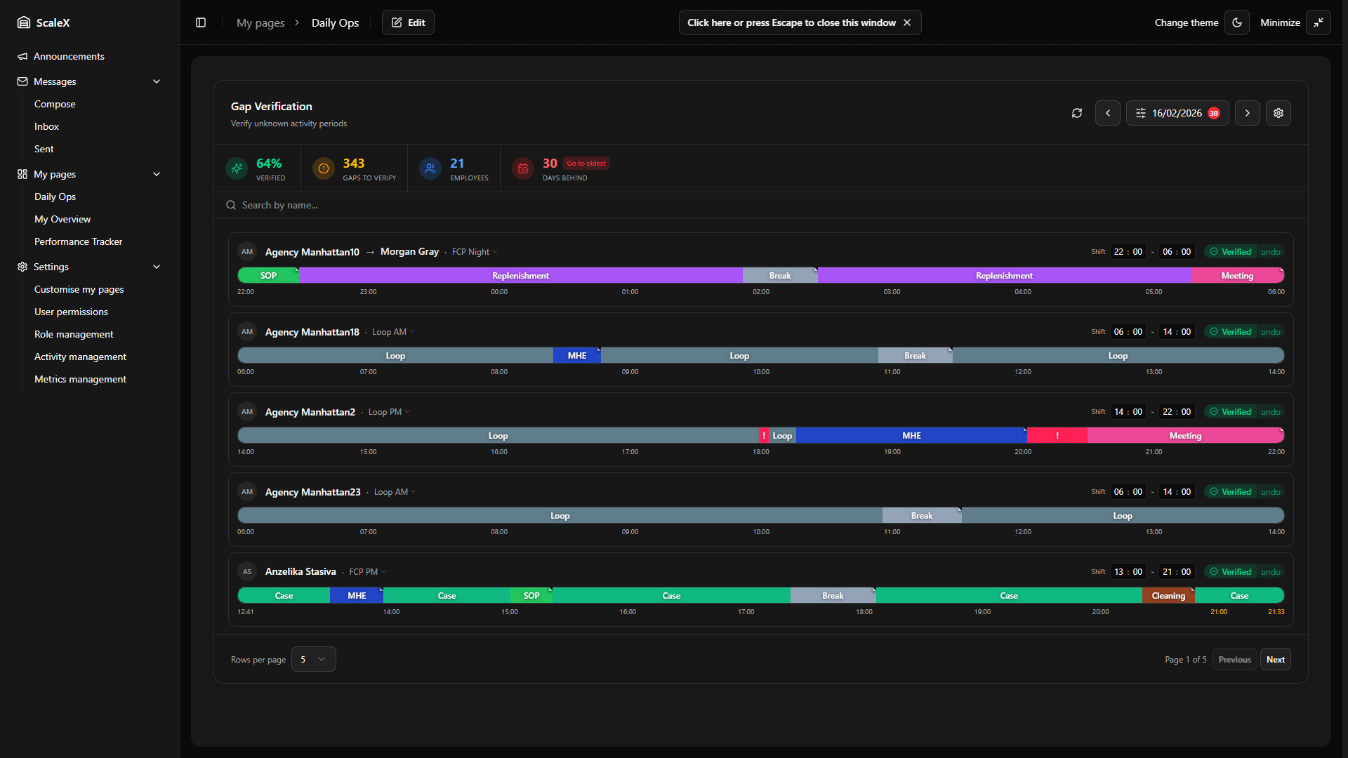
Statistics Bar
| Statistic | Colour | Description |
|---|---|---|
| Verified | Green | Percentage of gaps resolved for the current day/department. Shows "N/A" when there are no employees with transactions. |
| Gaps to verify | Amber | Total unresolved gaps remaining for the current view. |
| Employees | Blue | Count of employees currently displayed (after applying filters). |
| Days behind | Red | Past days with unresolved gaps. If greater than zero, a "Go to oldest" button appears that jumps to the earliest pending day. |
Search Bar
Below the statistics bar, a search input allows filtering employees by name. Results update as the user types. A clear button (×) resets the search.
Employee Timeline List
Paginated list (5 or 10 per page, configurable in the footer). Each employee row contains:
Employee Card
- Avatar — circle with the employee's initials.
- Name — clickable, opens the Employee KPI Modal.
- Department — displayed next to the name. Clicking it opens a dropdown to reassign the employee to a different department or mark them as "Unassigned".
- Shift time inputs — two editable time fields (HH:MM – HH:MM). The cursor automatically advances through the fields (hours → minutes → next field), so a full shift time can be entered without lifting hands from the keyboard. Arrow keys and Tab can also be used. The time is saved when the user leaves the field, presses Enter, or finishes typing in the last field. Start and end times cannot be set to the same value.
- Overtime (OT) button — appears next to the shift inputs when the shift is at least 8 hours long. Clicking it opens an hours:minutes input to specify manual overtime. The timeline extends by the entered amount and time labels in the overtime zone turn yellow. Overtime can be removed by clicking the undo icon next to the input.
- Status badge — Setup (no shift configured), X gaps (unresolved count), or Verified (with undo button).
Agency User Accounts
For employees whose username starts with "agency." (shared/temporary accounts used by agency workers), the card displays the assigned person's name on the first line with a small amber "A" badge on the avatar. Below the name, a "via Agency Name" label links to the User Assignment Popover where leaders can assign or change the real person's identity for that day. The popover shows a searchable list of temporary users and the ability to create new ones by entering a first and last name. When a real person is assigned, searching filters by their name rather than the agency account name.
Timeline Bar
Below each employee's header is a horizontal timeline bar representing their entire shift (or expanded to cover all transactions if they extend beyond shift boundaries). The timeline is divided into colour-coded segments:
| Segment | Appearance | Meaning |
|---|---|---|
| Activity | Colour-coded by activity | System auto-recognised the work based on WMS transactions. Hovering shows: activity name, time range, duration, and transaction count. Manually assigned segments have a small ▲ indicator in the top-right corner. |
| Gap | Amber "?" | No transactions recorded — needs to be resolved. Hovering shows: "Unknown Gap", time range, and duration. |
| Unknown | Rose/Red "!" | Transactions exist but don't match any activity definition — indicates a configuration issue. Clicking opens a popover showing time range, duration, and transaction count. |
| Setup Required | Grey | No default shift configured. The entire timeline displays a "Set shift hours" message. |
Overtime indicators: If the shift is at least 8 hours long, an overtime line is drawn at the configured threshold. Time labels beyond this mark are displayed in yellow.
Manual overtime: Leaders can specify an exact overtime duration using the OT input on the employee card. When set, the timeline extends by exactly that amount beyond the shift end, regardless of whether transactions exist in that period. Setting overtime to zero prevents any additional extension — though the timeline will still stretch to include activity that overlaps with the shift end.
Overtime buffer (automatic): When no manual overtime is configured, the system uses a grace period (set in Gap Settings) to look for activity beyond the shift end. If an employee keeps working past their shift, any transactions detected within this buffer window are automatically pulled into the timeline. Think of it as a safety net — the system watches for a set period after the shift ends and captures any work that spills over.
Pre-shift transactions: If an employee has transactions before their shift start time, the timeline extends backwards to include them. KPI is calculated from the first transaction, not the shift start — the employee receives credit for the full working period.
Time labels: Below the timeline bar, hour markers show the progression of time (e.g., 06:00, 07:00, 08:00…) with the shift start and end times at the edges.
Timeline Zoom
When an employee's timeline contains more than 10 time blocks and a default shift is configured, a zoom button (magnifying glass icon) appears in the top-right corner of the employee's header. Clicking it activates a 3× magnification that enlarges the timeline for detailed inspection of densely packed segments.
Mouse-Driven Navigation
In zoomed mode, the visible portion of the timeline follows the mouse cursor — moving the cursor left pans to earlier segments, moving right pans to later segments. The panning is proportional to the cursor position within the container. A 5% dead zone on each edge prevents accidental panning when the cursor is near the boundaries.
Visual Indicators
When more content is available beyond the visible area, pulsing chevron arrows appear at the left and/or right edges of the timeline, along with a subtle shadow fade. These indicators disappear when the timeline is fully panned to that edge. Time labels below the timeline are recalculated for the zoomed view and smoothly fade at the edges.
Click the zoom button again (now showing a zoom-out icon) to return to the normal view.
Resolving a Gap
Clicking on an amber gap segment ("?") opens a dropdown with:
Time Range Header
At the top, the gap's time range is displayed (e.g., "10:15 – 11:30"). The end time is editable — the user can change it to split the gap. For example, if a gap runs from 10:15 to 11:30 and the user changes the end time to 10:45 before selecting an activity, only the 10:15–10:45 portion is resolved, and a new gap is automatically created for the remaining 10:45–11:30 portion.
Activity Selector
A searchable list of activities grouped into three categories: Direct (activities with measurable output), Indirect (supporting activities — no KPI), and Other. Each activity shows its colour swatch and name. If the gap had transaction data spread across multiple activities, the transaction count per activity is displayed, helping the leader make an informed decision.
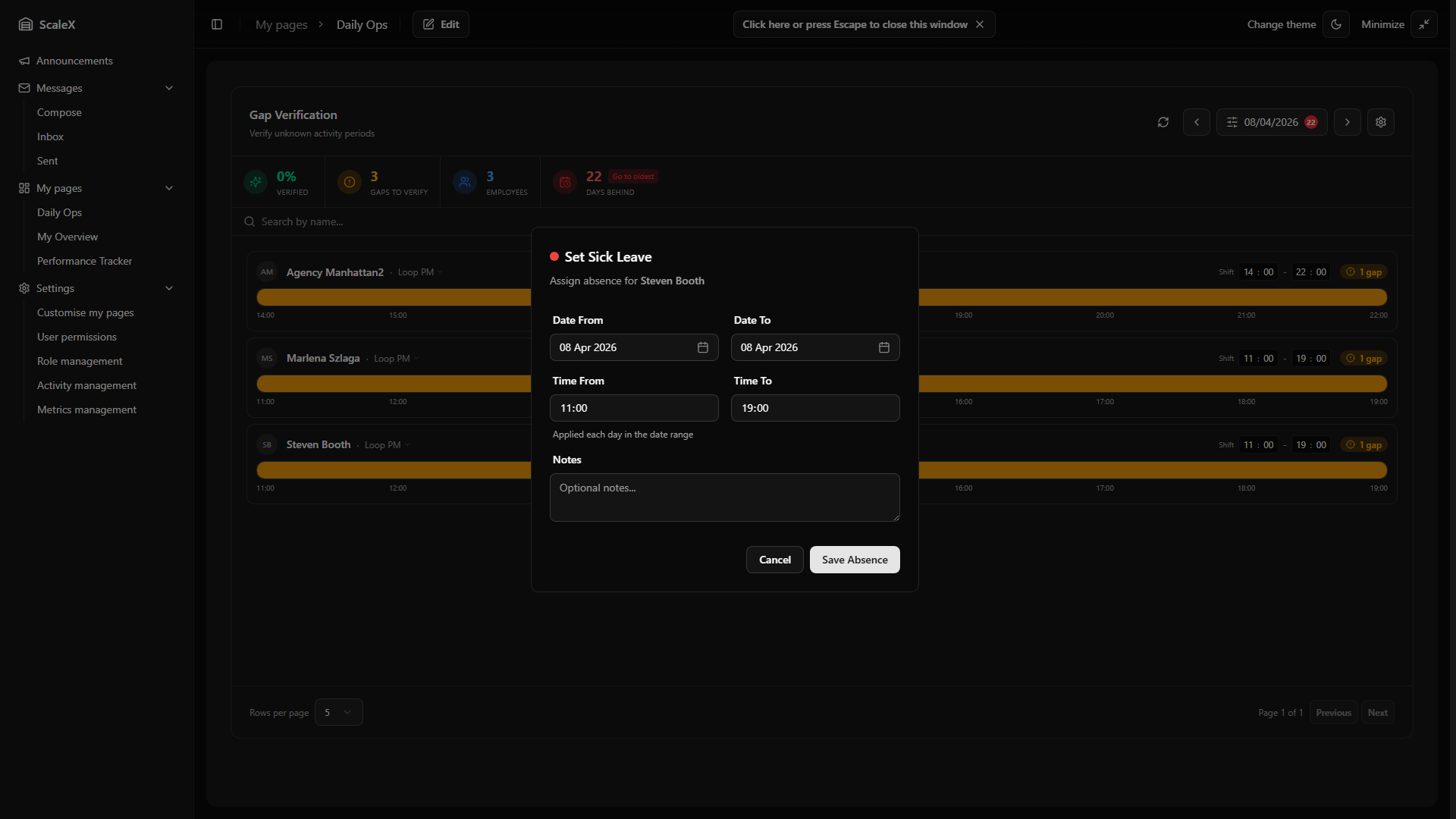
Absence Types
Below the activities, a separate "Absences" section lists all configured absence types (e.g., Holiday, Sick Leave, Unauthorised Absence). Selecting an absence type opens the Absence Modal instead of immediately resolving the gap.
When an activity is selected, the gap is immediately resolved — the segment changes from amber to the activity's colour, the gap count decreases, and the statistics update in real-time. The resolution is saved to the server in the background.
If the same timeline is open in multiple browser windows, overlapping edits are handled automatically — saving a new resolution removes any existing resolutions that conflict with it, so the most recent edit always wins cleanly.
Modifying an Existing Segment
Clicking on any already-recognised activity segment (including manually resolved ones) opens a dropdown with:
- Change activity — allows selecting a different activity. If the segment has transaction data, only activities with matching transactions are shown. Selecting triggers a confirmation dialog displaying the current and proposed activity side by side with an arrow between them.
- Add/Edit note — attach a text note to the resolution explaining the assignment (e.g., "Confirmed with team leader — employee was helping in receiving").
- Clear assignment — removes the manual resolution and reverts the segment back to a gap. Only available for segments that were manually resolved.
For absence segments, the dropdown shows:
- Edit absence — opens the Edit Absence Modal to modify absence details.
- Clear absence — if the absence is part of a multi-day series, a dialog asks whether to delete just this single segment or the entire series across all days.
Absence Modal (Create)
Opened when selecting an absence type from the gap dropdown. Contains:
- Absence type — pre-selected based on what was clicked (shown with colour swatch).
- Date From / Date To — calendar pickers. Defaults to the currently selected day. Can be extended to span multiple days (e.g., for a week-long holiday), which creates an absence series.
- Time From / Time To — time inputs. Defaults to the exact gap boundaries.
- Notes — optional free-text field for additional context.
Saving creates the absence and resolves the corresponding gap(s). If the date range spans multiple days, an absence entry is created for each day in the range (an absence series).
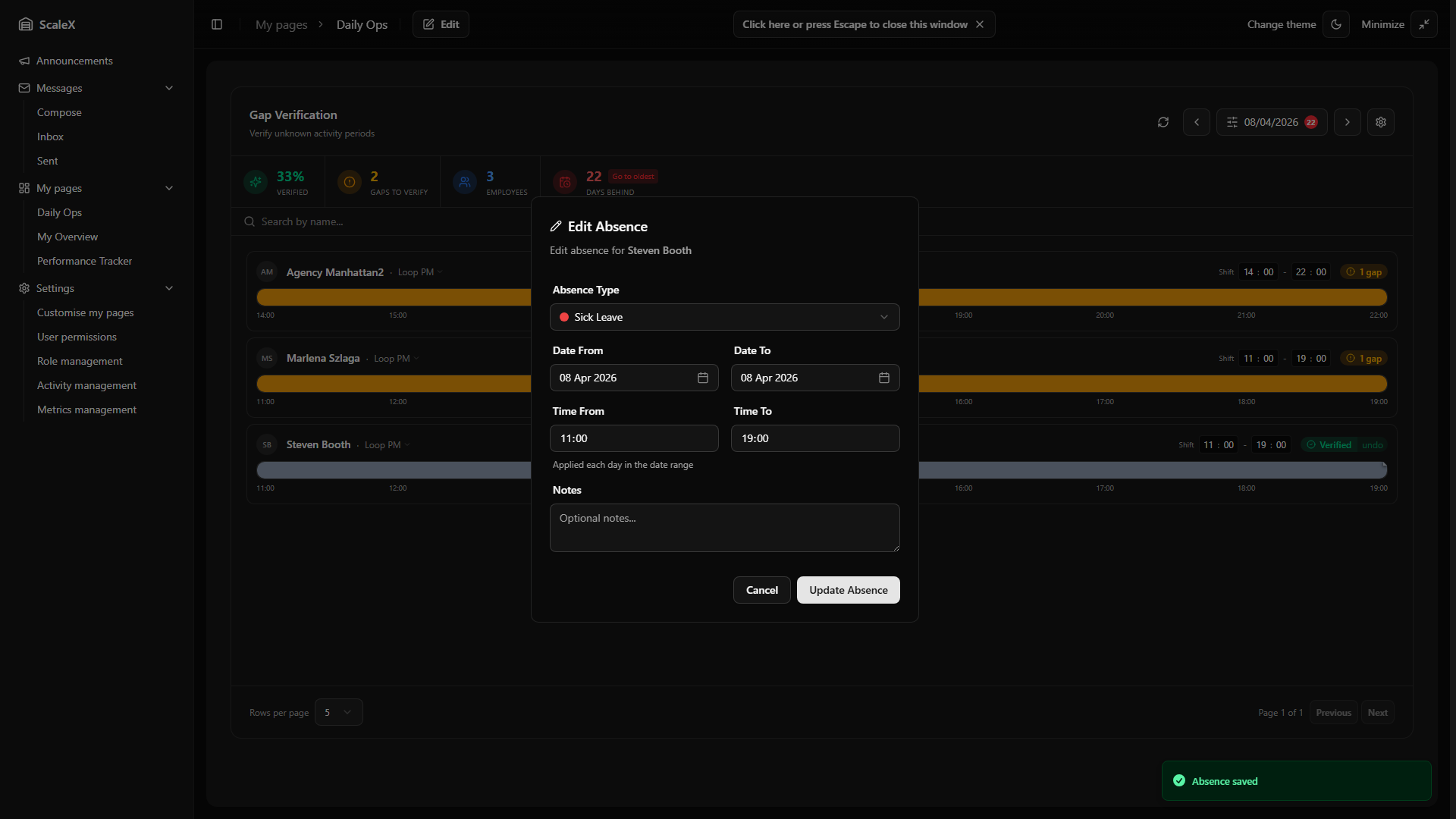
Edit Absence Modal
Opened when clicking "Edit absence" on an existing absence segment. Contains the same fields as the Create modal, plus the ability to change the absence type via a dropdown listing all available types with their colour swatches. The date range and time range can also be modified.
Delete Absence
When clearing an absence that belongs to a multi-day series, a dialog presents two options: "Delete this segment only" (removes only the current day's absence, leaving the rest of the series intact) or "Delete entire series" (removes all absence entries across all days). For single-day absences, a simple confirmation dialog is shown.
Undo Verification
When an employee's timeline is fully verified (green "Verified" badge), an "undo" button appears. Clicking it opens a confirmation dialog warning that all resolutions and absences for that employee on that day will be removed. The timeline resets to raw transaction data and recalculates gaps using the current gap settings. The employee's KPI data for that day is also cleared.
Auto KPI Calculation
When the last gap on an employee's timeline is resolved, the system automatically: marks the employee as "fully verified" for that day, calculates and saves KPI metrics (total hours, direct hours, indirect hours, performance percentage, transaction counts) based on the verified timeline, and updates the pending days tracker — if all employees for a given day are now verified, that day is removed from the "Days behind" count.
If any resolution is later changed, cleared, or a verification is undone, the system automatically recalculates KPI metrics. If all gaps remain resolved after the change, the employee stays verified with updated KPI values. If a gap is reopened, the KPI data is removed and the day returns to the pending list.
Strict Mode
A per-employee toggle activated via a scissors icon button on the employee's header row (visible when a default shift is configured). The button turns red when active. When enabled, the timeline is locked to the exact shift boundaries (start time, end time, plus any configured overtime). The system enforces hard limits:
- Transaction clipping — WMS transactions that fall outside the shift window are excluded from the timeline entirely.
- Resolution clipping — manual resolutions (activity assignments, absences) are trimmed to fit within the shift boundaries. A resolution that partially overlaps the shift edge is cut at that edge.
- No timeline expansion — unlike the default mode, the timeline will not stretch to accommodate pre-shift or post-shift activity.
Safety Guards (Default Mode)
When Strict Mode is off (the default), the system applies a set of safety guards to ensure no legitimate work is lost during the verification process:
- Automatic timeline expansion — the timeline stretches to include all detected activity, even if transactions fall before the shift start or after the shift end. Employees receive credit for the full working period.
- Smart segment continuation — if an activity is in progress when the shift boundary is reached, the segment extends naturally rather than being cut off. This prevents artificial gaps at the edges of the shift.
- No automatic trimming — transactions and resolutions are never discarded. All data is preserved and visible on the timeline.
- KPI protection — KPI metrics are only calculated after full verification, ensuring that incomplete data does not produce misleading performance numbers.
Recurring Start Activity
Leaders can assign a default start activity for an employee that automatically resolves the first gap of each shift. Once set, the system fills the opening gap segment with the chosen activity every day — no manual intervention needed.
Setting Up
When resolving the first gap on an employee's timeline, each activity in the dropdown shows a repeat icon on hover. Clicking this icon (instead of the activity name) sets that activity as the recurring start activity for the employee. The first gap is immediately resolved up to the gap threshold duration, and any remaining time is auto-resolved as a continuation.
Visual Indicators
When a recurring start activity is active, the first segment displays a "Recurring start activity" label with a repeat icon in its tooltip. The repeat icon button on the first block is highlighted in the primary colour, indicating the setting is active.
Removing
To remove the recurring start activity, click the highlighted repeat icon on the first activity block, or use the "Clear recurring" option in the segment's dropdown menu. Removing it reverts the first gap back to unresolved and stops auto-assignment on future days.
Day Off
Mark a date as a non-working day for an employee. A Day off employee shows a single grey "Day off" block spanning the whole shift, the timeline is treated as fully verified, and the day is removed from the pending count. KPI is not calculated for a Day off date.
Setting a Day Off
Day off is set from the empty timeline of an employee with no transactions. Clicking the unresolved gap opens the activity selector — a "Day off" entry appears in the Other section (only when the gap has no transaction data; if WMS recorded any activity, the entry is hidden). Selecting it opens a confirmation dialog with two options:
- Only this day — writes a per-date override for the selected date.
- Every [day of week] — writes a recurring rule for that weekday, applying from the selected date onward (past dates of that weekday are not retroactively rewritten).
Resolution Order
When the system decides whether a date counts as a Day off for an employee, it applies these rules in order:
- Transactions win — if WMS recorded any activity for that date, it is never a Day off (the rule is automatically suppressed).
- Per-date override wins over recurring rule — useful for exceptions, e.g., "every Saturday is a day off, except this one Saturday when the leader worked".
- Recurring rule — applies on its weekday within its effective window (see below).
Effective Window for Recurring Rules
Recurring rules carry two date markers: effective from (the earliest date the rule applies) and effective to (the rule stops applying from this date onwards — past occurrences stay intact). When a recurring rule is created, effective from is set to the date the leader was viewing, so historical data is never rewritten retroactively.
Day Off State on the Timeline
- Status pill — replaces the gaps/verified badge with a grey "Day off" pill (with a calendar-off icon). Hovering reveals whether it is a Recurring rule or Single override.
- Timeline block — a single grey block covers the full shift, labelled "Day off". No shift time editor or strict-mode toggle is shown for that day.
- Verification — the day counts as fully verified; gap counts are zero, and pending-days does not include this date.
Clearing a Day Off
Clicking the Day off block opens a dropdown. The bottom "Clear assignment" action behaves differently depending on the rule type:
- Single override — clears immediately, restoring the normal (empty) timeline so the leader can verify or assign activities.
- Recurring rule — opens a chooser dialog with two options:
- Just this date — writes a per-date override (
is_day_off=false) without touching the recurring rule. Future occurrences of the weekday remain Day off. - From this date onwards — sets effective to on the rule. Past Day-off dates stay intact (historic KPI is not affected); from this date forward the rule no longer applies.
- Just this date — writes a per-date override (
Replacing Day Off with an Activity
The dropdown on a Day off block also includes the activity selector. Picking an activity writes an override (is_day_off=false) for that date, reloads the timeline, and assigns the chosen activity to the resulting full-shift gap in one motion.
Interaction with Auto-Resolution
The auto-resolution background service skips Day off employees entirely — no auto-resolved segments and no auto-assigned break are created for those dates. This applies whether the Day off comes from a recurring rule or a single override.
Auto-Resolution
A background service that automatically resolves gaps for eligible employees without manual intervention. The service runs every 5 minutes and processes employees whose shifts have ended plus a configurable buffer period.
How It Works
- Eligibility window — an employee becomes eligible for auto-resolution once their shift end time plus a configurable buffer (default: 5 hours) has passed. For night shifts that cross midnight, the shift end is calculated on the following day.
- Lookback period — the service checks a configurable number of past days (default: 7 days), catching any gaps that were missed.
- Non-destructive — auto-resolution only fills gaps that have not already been manually resolved. Existing manual resolutions are preserved.
- Day off employees skipped — users marked as Day off (recurring or override) are skipped entirely on that date — no auto-resolved segments and no auto-assigned break.
Auto-resolution can be enabled or disabled in Gap Settings. When enabled, the configurable parameters are: buffer hours after shift end, number of lookback days, and break duration limits (minimum and maximum minutes for the auto-assigned break — see below).
Auto-Assigned Break
During auto-resolution, the service picks one of the auto-resolved gap segments per employee per day and assigns it the Break activity code. This avoids inflating direct/indirect hours with what is most likely a meal or rest break.
- Candidates — only auto-resolved gaps whose duration falls within the configured break min/max minutes are considered (defaults: 30–60 minutes).
- Selection — among the candidates, the segment whose midpoint is closest to the shift midpoint wins; ties are broken by shorter duration.
- One per user per day — if a Break already exists for the user on that date (manual or previously auto-assigned), no further break is assigned.
- Visual — the segment is rendered in the Break activity colour and labelled "Auto-assigned break" in its tooltip.
Filter Persistence
All filter selections — date, department, show only with gaps, show users without transactions — are persisted as part of the widget layout and survive page refreshes.
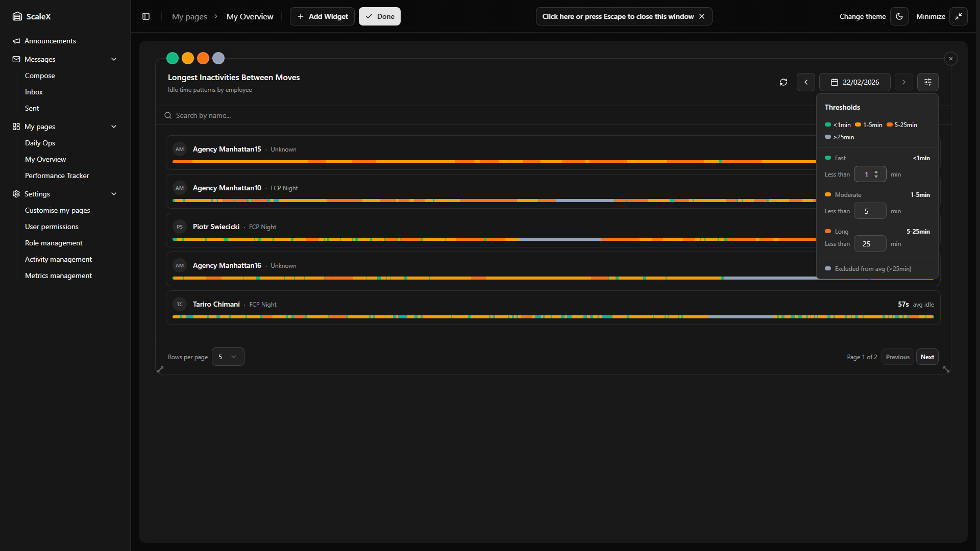
Longest Inactivities Widget
Analyse idle time between transactions to spot inefficiencies.
Analyses idle time between WMS transactions for each employee on a given day. Ranks employees by their average idle time and provides a visual breakdown of how inactivity periods are distributed throughout the shift. The purpose is to identify employees who spend too much time between moves (transactions) — which may indicate inefficiency, equipment issues, or areas needing attention.
How Inactivity is Calculated
An "inactivity" is the time gap between two consecutive WMS transactions for the same employee. For example, if an employee scans a pick at 10:15:00 and their next scan is at 10:18:30, that's a 3.5-minute inactivity. The widget collects all such gaps throughout the day and computes statistics (average, median, max).
Inactivities that exceed the exclusion threshold (configurable, default 25 minutes) are excluded from the average calculation. These are considered outliers — likely breaks, meetings, or other planned absences rather than genuine idle time. They still appear on the timeline but are visually separated and don't inflate the average.
Header
- Refresh button — reloads all data.
- Previous / Next day buttons — navigate one day at a time. Future dates are disabled.
- Date picker — calendar to jump to any date (up to today).
- Thresholds button — opens the thresholds popover.
- Department dropdown — filter the employee list by department. Defaults to "All Departments"; selecting a specific department shows only employees assigned to it.
Thresholds Popover
Controls how inactivity durations are colour-categorised. Four colour bands are defined by three configurable threshold values. The thresholds enforce ordering — each must be higher than the previous. A live legend preview at the top of the popover shows the current ranges. Changing any threshold immediately clears and recalculates all timeline previews.
| Band | Colour | Default Range |
|---|---|---|
| Fast | Green | < 1 minute — quick, efficient transitions |
| Moderate | Amber | 1 – 5 minutes |
| Long | Orange | 5 – 25 minutes |
| Excluded | Grey | > 25 minutes — excluded from average calculations |
Search Bar
Filters employees by name. Results update as the user types.
Employee List
A paginated list (5 or 10 per page) of employee cards, sorted by average idle time descending (worst performers at the top). Each card shows:
- Avatar with initials, name, and department.
- Average idle time — the main metric, displayed prominently on the right.
- Preview timeline bar — a thin horizontal bar showing the distribution of inactivity durations throughout the shift, colour-coded by the threshold bands. A mostly green bar means the employee was consistently fast, while orange segments indicate problem periods.
The preview timelines use a two-tier loading approach: the initial API call loads the lightweight employee list (names, stats), then a second call lazily loads the timeline preview data only for the currently visible page. This keeps the initial load fast.
Clicking an employee card opens the Employee Detail Drawer.
Employee Detail Drawer
A bottom drawer that slides up when clicking an employee.
Header
Employee name (clickable — opens the Employee KPI Modal) and department.
Metrics Grid
Four stat cards in a row:
- Avg Idle (green) — average inactivity duration, excluding outliers above the threshold.
- Median (blue) — the median inactivity duration.
- Max Idle (orange) — the longest single inactivity recorded.
- Transactions — the total number of WMS transactions for the day.
Full Timeline
A horizontal bar chart similar to the preview but larger and interactive. Consecutive inactivities of the same colour band are grouped into segments. Each segment represents one or more inactivities that fall into the same threshold category and occurred sequentially. Segments are clickable — hovering shows a tooltip with the average duration, count of inactivities, and time range. Small segments are guaranteed a minimum visual width so they remain visible and clickable.
A colour legend below shows the four bands with their current threshold values.
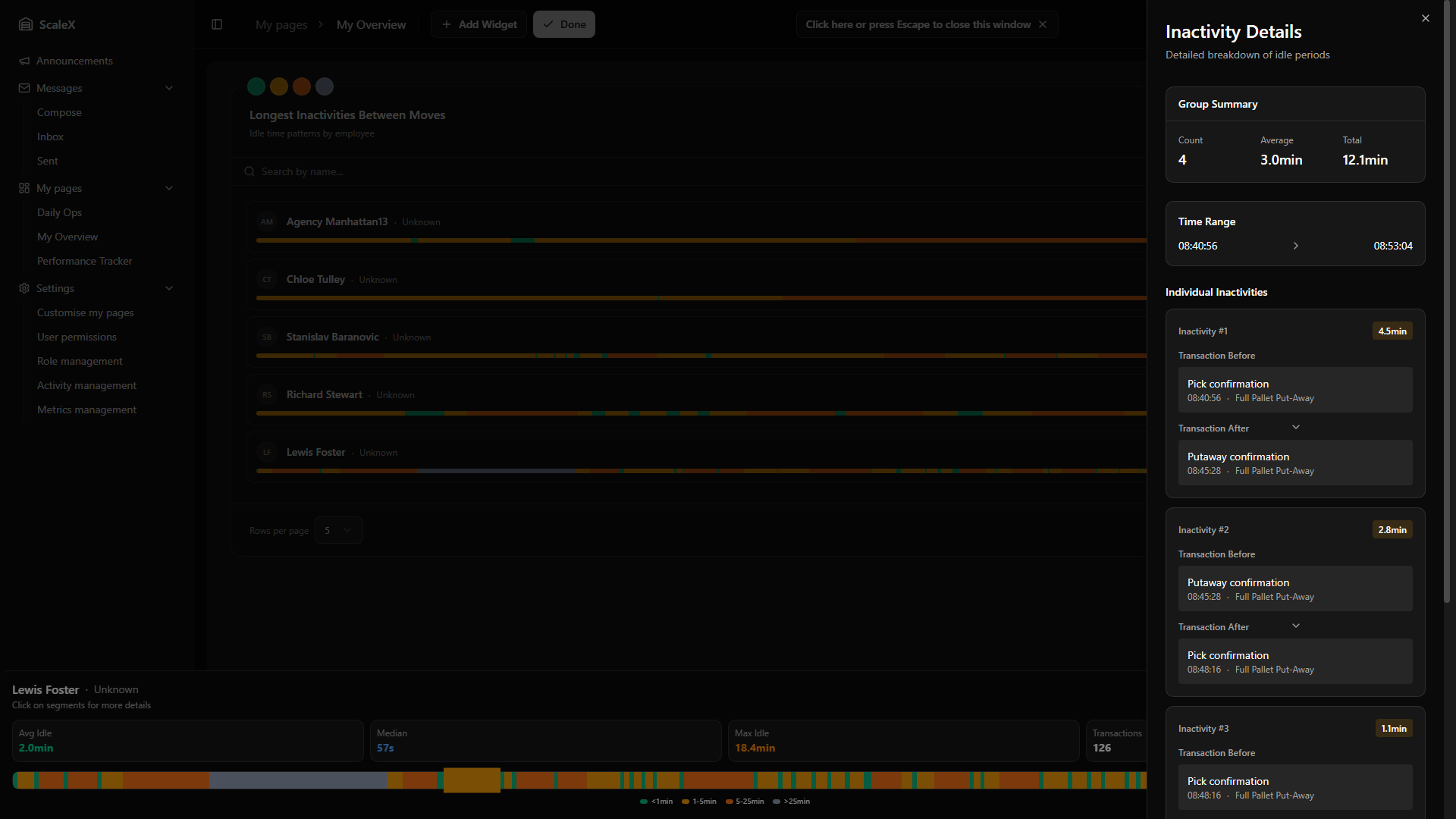
Segment Detail Sheet
Clicking a segment on the drawer timeline opens a right-side sheet with a detailed breakdown of every inactivity within that segment group:
Group Summary
- Count — how many individual inactivities are in this group.
- Average — average duration across the group.
- Total — combined duration of all inactivities in the group.
- Time Range — the start and end time of the group.
Individual Inactivities
Each inactivity is displayed as a card showing:
- Inactivity number and duration — with a colour-coded badge matching the threshold band.
- Transaction Before — the WMS transaction type and time that occurred immediately before this idle period, plus the work type (e.g., "PICK").
- Transaction After — the WMS transaction type and time that ended this idle period, plus the work type.
- Excluded badge — if the inactivity exceeds the exclusion threshold, a warning badge indicates it was excluded from the average calculation.
This level of detail allows leaders to understand exactly what happened — which transactions bookended each idle period, whether the employee switched work types, and at what time of day the idleness occurred.
Pagination
Footer contains rows per page selector (5 or 10), page indicator ("Page X of Y"), and Previous/Next buttons. When searching, the filtered result count is displayed.
Filter Persistence
All settings — date and all three thresholds — are persisted as part of the widget layout and survive page refreshes.
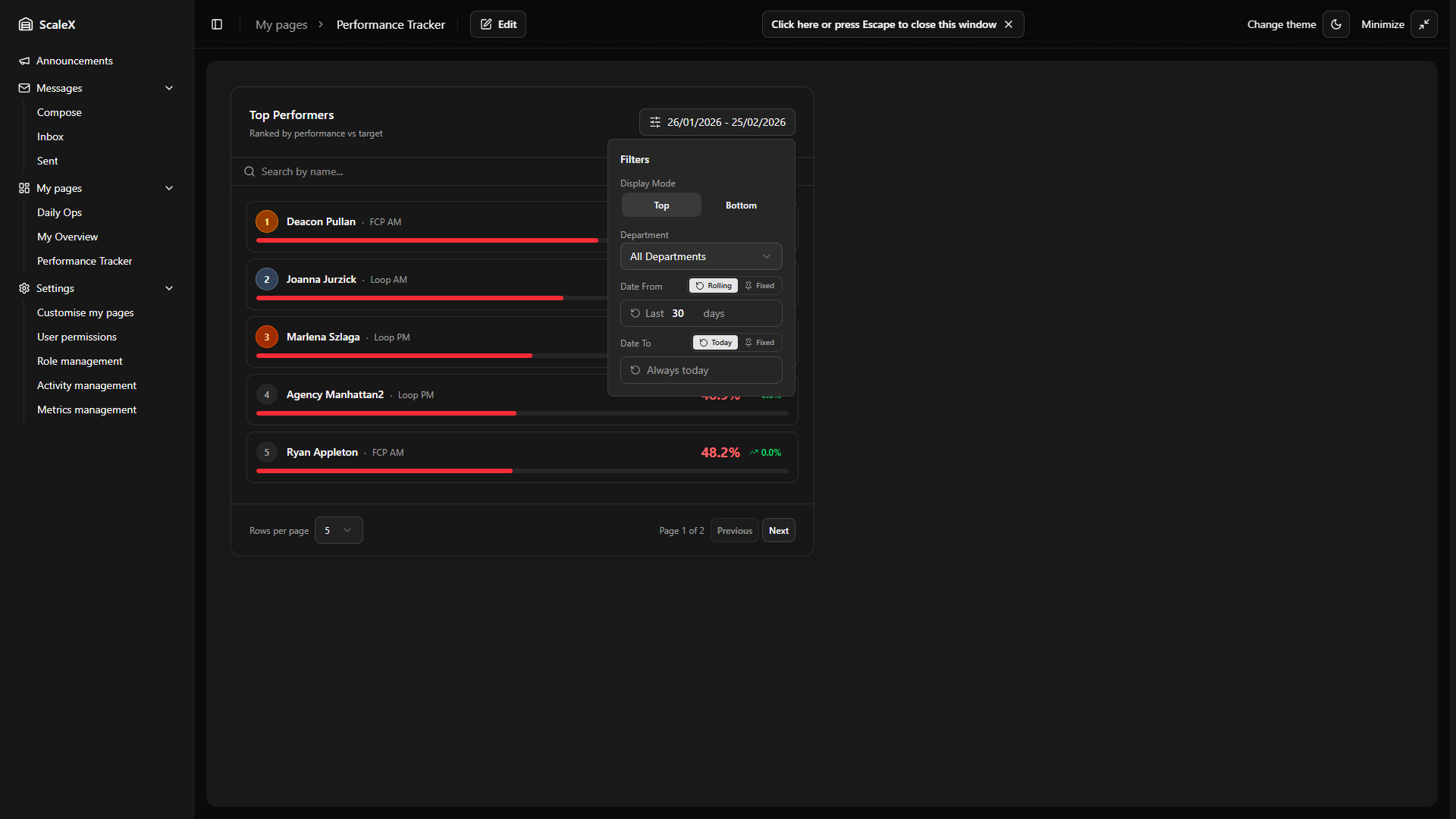
Top / Bottom Performers
Rank employees by average performance over any date range.
Ranks employees by their average performance percentage over a configurable date range. It answers the question "who are our best (or worst) performers across a given period?" Performance is calculated as actual output versus the standard target defined on each activity (Standard Per Minute × minutes worked). An employee averaging 105% is producing 5% above target; one averaging 78% is significantly below.
Header
The header displays a dynamic title — switching between "Top Performers" and "Bottom Performers" depending on the current mode. A Filters button opens the filters popover and shows the currently selected date range as a summary label.
Filters Popover
- Display Mode — toggle between Top (sorted by performance descending, best first) and Bottom (sorted ascending, worst first).
- Department — dropdown to filter by a specific department or view "All Departments".
- Display Count — 10, 20, or 50 employees returned.
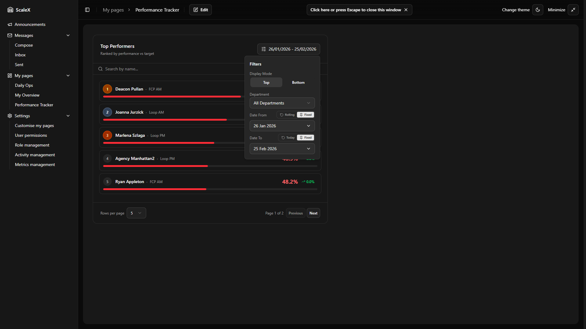
Date range — each date field ("Date From" and "Date To") has a mode toggle:
- Rolling default — "Date From" is set as "Last N days" (default: 30). The start date recalculates automatically each day.
- Fixed — a calendar picker lets the user choose a specific date.
- Today default — "Date To" always resolves to today's date.
Fixed + Fixed — e.g. 1 Jan → 31 Jan. Compare the same fixed month every time, regardless of the current date.
Fixed + Today — 1 Jan → today. Rankings cover from a fixed start date up to the present, growing longer each day. Useful for tracking cumulative performance since the start of a quarter or year.
Search Bar
Filters the returned performer list by name. Real-time filtering as the user types.
Employee Cards
A paginated list of employee cards ranked by performance. Each card shows:
- Rank badge — numeric position (1, 2, 3…). In Top mode, the first three positions have special styling: gold (#1), silver (#2), bronze (#3). In Bottom mode, all ranks use the default neutral style.
- Name and department.
- Performance percentage — the main metric, displayed prominently. Colour-coded performance thresholds.
- Trend indicator — an arrow (up or down) with a percentage showing how the employee's performance is trending. Green for positive trend, red for negative.
- Performance bar — a horizontal progress bar filled proportionally to the performance percentage (capped at 100% width). Bar colour matches the performance threshold colour coding (green/amber/red).
Clicking an employee card opens the Employee KPI Modal with the widget's date range pre-set, so the leader can drill into that employee's detailed KPI for the same period.
Pagination
Footer contains rows per page selector (5 or 10), page indicator ("Page X of Y"), and Previous/Next buttons. When searching, the filtered result count is also displayed.
Filter Persistence
All settings — mode (top/bottom), department, date range settings (including mode and rolling days), and display count — are persisted as part of the widget layout and survive page refreshes. Rolling dates re-compute automatically on each page load.
Employee Performance Widget
Weekly performance grid with daily breakdowns, idle time tracking, trends, and notes.
The Employee Performance widget displays a weekly performance grid for all employees in a department. Each row represents an employee, and each column represents a day of the week (Monday–Sunday). The widget provides a compact, at-a-glance view of daily performance, idle time, and trends — making it easy to spot underperformers and patterns across the week.
Header & Controls
The header displays the title "Employee Performance Overview" with the subtitle "Weekly performance, idle time and trends by employee". Control buttons include:
- Refresh button — reloads the current week's data.
- Previous / Next week buttons — navigate one week backward or forward. The current week label shows "Week X · MonDD – SunDD, YYYY".
- Filters button — opens a popover with a Department dropdown to filter employees by department. The button label shows the currently selected date range in DD/MM/YYYY format.
- Visibility toggle (eye icon) — opens a popover with toggles to show or hide the statistics bar and search bar.
Statistics Bar
An optional row of four department-level summary metrics:
| Metric | Description |
|---|---|
| Dept Avg | Average performance percentage across all employees for the week. |
| Idle Avg | Average idle time in minutes across all employees. |
| Attendance | Attendance percentage — share of scheduled days employees were present. |
| Headcount | Total number of employees in the current department view. |
The statistics bar can be hidden via the visibility toggle in the header.
Search Bar
An optional search input that filters employees by name or username in real time. Can be hidden via the visibility toggle.
Performance Grid
The main table with the following columns:
Employee Column (sticky)
Shows the employee's avatar (coloured circle with initials) and name. Clicking the name opens the Employee KPI Modal with the current week's date range.
Labels Column (sticky)
Three row labels aligned with the three data zones in each day cell:
- Performance — the employee's daily performance percentage.
- vs idle target — deviation from the idle target (how much over or under the acceptable idle threshold).
- total idle — total duration of idle time for the day.
Day Cells (Mon–Sun)
Each day cell contains three stacked zones:
Performance zone — shows the performance percentage, colour-coded by performance thresholds (green / amber / red). If a note exists for that day, a coloured dot badge appears next to the percentage. Clicking opens the Employee KPI Modal on the functions/performance tab for that day.
Idle vs target zone — shows the deviation from the idle target as ±Xm Xs (e.g., "+2m30s" or "−1m15s"). Colour-coded: green if within target, grey if slightly over (0–2 min), amber if moderately over (2–5 min), red if significantly over (>5 min). Clicking opens the Employee KPI Modal on the inactivities tab.
Total idle zone — shows the total idle time for the day. Colour matches the performance band. Clicking opens the Employee KPI Modal on the inactivities tab.
Special Day States
| State | Display |
|---|---|
| Absent | "Absent" in red text with red background tint. No clickable zones. |
| Unverified | "—" in muted text. No data available. |
| Indirect only | "Indirect only" in blue text. Employee worked only indirect activities — no direct performance metric. |
Trend Column
Three trend indicators (matching the three day-cell zones) calculated via linear regression across all working days in the week:
- Performance trend — green arrow up if improving, red arrow down if declining.
- Idle vs target trend — inverted logic: green if trending down (less deviation), red if trending up.
- Total idle trend — inverted logic: green if trending down (less idle time), red if trending up.
Week Summary Column
Shows the aggregated weekly average performance percentage with performance band colour coding. Below the number, a sparkline of seven tiny bars (one per day) provides a visual representation of the week — bar height reflects performance, colour matches the performance band, and absent days show as empty gaps. Unverified days display a dashed border.
Notes Column
If the employee has notes for the week, a summary button shows coloured dots (green for positive, blue for neutral, red for negative) and a total count. The button's colour reflects the most severe note type present. Clicking opens the Employee KPI Modal on the notes tab. If no notes exist, the cell shows "—".
Performance Colour Coding
Consistent colour coding based on configurable performance thresholds:
- Green — meeting or exceeding the green threshold.
- Amber — between the yellow and green thresholds.
- Red — below the yellow threshold.
These thresholds are shared with all other widgets and configurable in Settings.
Footer Legend
A legend bar at the bottom shows the three performance band ranges with colour blocks, followed by note type indicators (green/blue/red dots labelled "Notes").
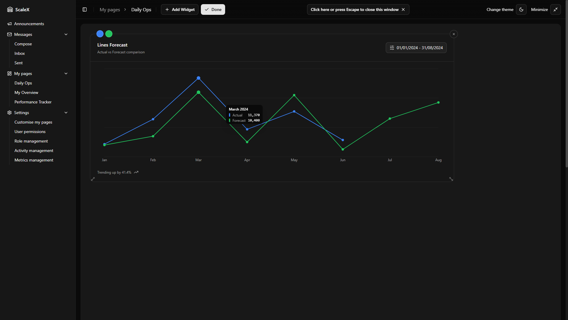
Forecast Widget
Actual vs forecast performance comparison over time.
The Forecast widget will display a line chart comparing actual warehouse performance against forecast targets over a selected time period. It will help managers see whether operations are tracking above or below projections and identify trends early.
Planned Design
The sections below describe the planned functionality based on the current design.
What It Will Show
Two lines plotted on the same chart:
- Actual — real performance data from completed periods.
- Forecast — projected values extending into future periods where actual data is not yet available.
Where both lines overlap (past periods), managers will be able to see how closely actual performance matched the forecast. Where only the forecast line continues (future periods), it will show projected targets.
Header
The header will show a dynamic title based on the selected unit type (e.g. "Lines Forecast" or "Replenishments Forecast") and the description "Actual vs Forecast comparison". A Filters button will open a popover with filter controls.
Filters
The Filters popover will contain:
- Unit Type — a dropdown to switch the metric being charted (e.g. Lines, Replenishments). Changing the unit type will immediately update the chart data.
- Date Range — a date range picker with a two-month calendar view. Selecting a range will filter the chart to show only data within that period.
Chart Interaction
Hovering over any data point on the chart will show a tooltip with the exact month and values for both lines. The Y-axis will adjust dynamically to fit the visible data range.
Trend Indicator
Below the chart, a footer will display a trend summary — showing the percentage change and direction (up or down arrow) across the selected period.
Custom Colours
The Forecast widget will support custom colour controls. In edit mode, colours for the Actual line and Forecast line will be customisable independently. These colour choices will be saved as part of the widget layout.
Filter Persistence
All filter selections — unit type and date range — will be persisted as part of the widget layout, surviving page refreshes.
Metrics Management
Define custom metrics imported daily from the WMS database.
Managed in Settings → Metrics management. This is where administrators define custom metrics that appear on the Summary widget and in Daily Breakdown views.
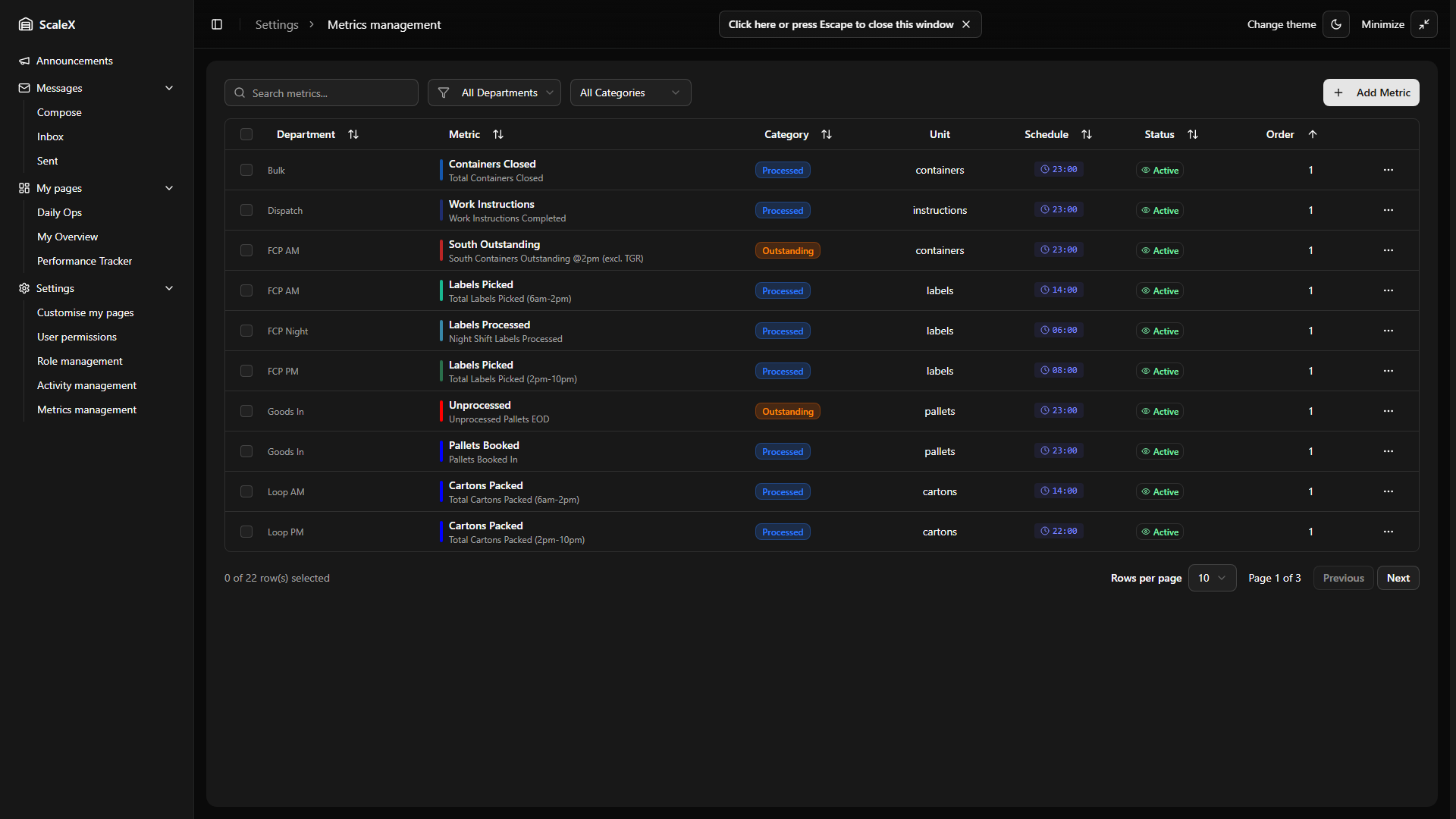
What is a Metric
A metric is a custom numeric value imported daily from the WMS database. It represents any measurable quantity relevant to a department — for example "Cartons Packed (AM shift)", "Orders Outstanding", "Pallets Received", etc. Each metric belongs to a specific department and is imported automatically by executing a SQL query against the WMS database at a scheduled time each day.
Metric Properties
cartons-packed-am). Unique per department. Locked after creation.Creating, Editing & Deleting
Creating: Click "Add metric", fill in the fields. The metric code is validated for uniqueness within the department. The category must be either "processed" or "outstanding". If both WMS SQL and Schedule Time are provided, the system will begin importing automatically from the next scheduled cycle. The new metric immediately becomes available in the Summary widget when viewing that department.
Editing: All fields changeable except Department and Code (locked after creation to preserve data integrity). Changes take effect immediately.
Deleting: Only possible if no historical data exists. If the metric has data, deletion is blocked — disable it instead by toggling Active to off.
Reordering Metrics
Metrics can be reordered within a department by changing their display order. This controls the sequence in which metrics appear in the Summary widget dropdown and in Daily Breakdown sections.
How Metric Import Works
The system runs a background sync cycle every 5 minutes. During each cycle, it checks which metrics are due for import based on their scheduled time:
The SQL query is executed against the WMS database.
If it returns a numeric value, that value is stored as the daily metric value for today.
The system backfills the previous 3 days — the SQL query is re-executed with adjusted dates, so if any data was missing or updated, it gets corrected. The 3-day backfill period is configurable and can be extended if needed.
If the query returns NULL, no value is stored for that day. Each metric is imported independently — if one fails, the others still proceed.
How Metrics Appear on Dashboards
Summary Widget
When a specific department is selected, the second chart tab becomes a dropdown listing all active "processed" metrics for that department (using their Short Name). The user selects which metric to chart — the bar chart shows the daily imported values over the selected date range. When "All Departments" is selected, this tab shows Average Idle Time instead (a built-in metric, not user-defined).
Daily Breakdown
When you click on a day bar in the Summary widget, the Daily Breakdown opens. For a specific department, the Activity tab shows two sections: Processed metrics and Outstanding metrics. Each metric displays its current daily value, a trend indicator (comparing the average of the first half of the history window against the second half), and a history bar chart.
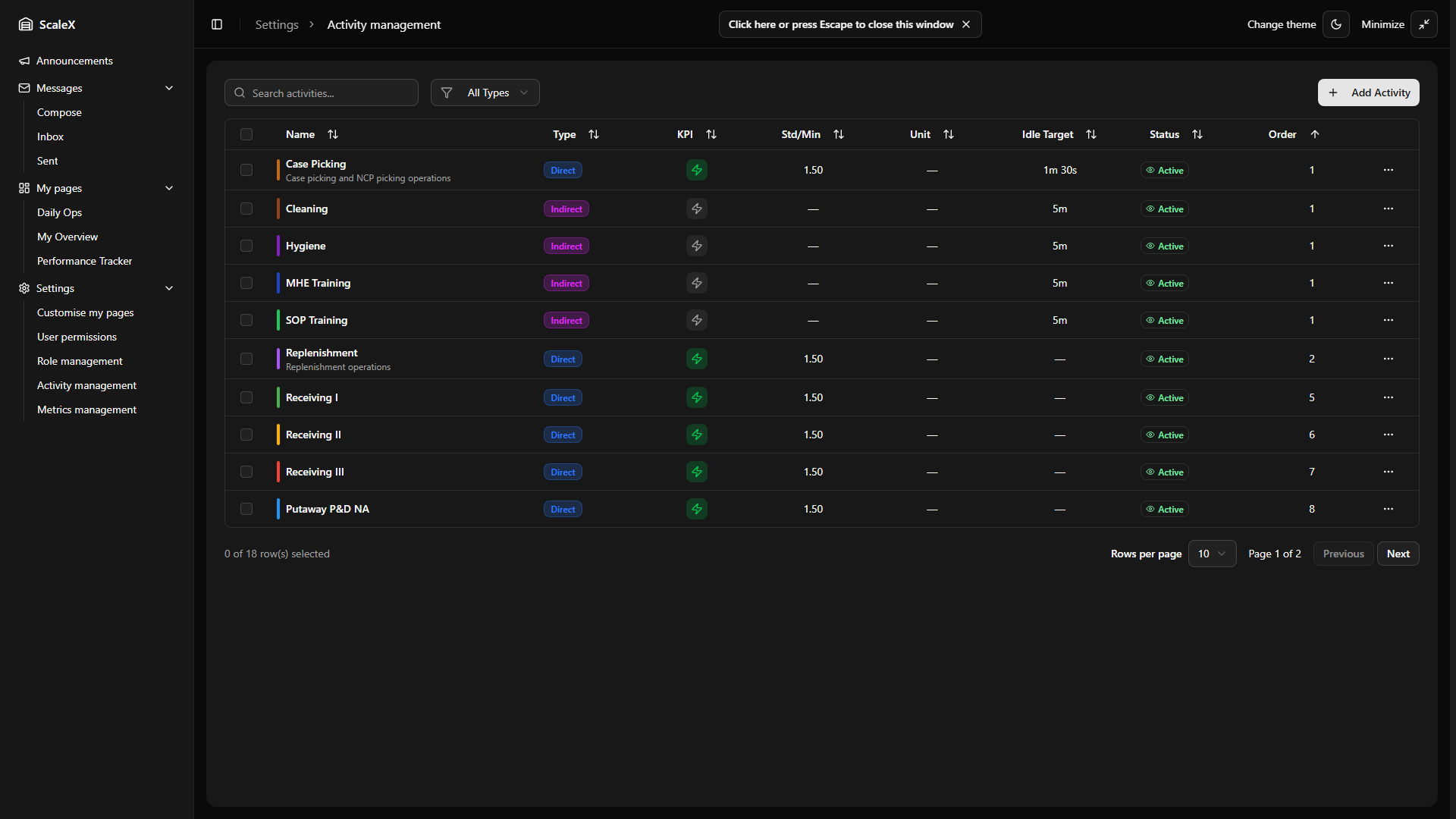
Activity Management
Define activities that map WMS transactions to timeline segments.
Managed in Settings → Activity management. This is where administrators define the activities (functions) that the system uses to recognise what employees are doing on the warehouse floor. Activities are the foundation of the Gap Verification widget — they determine how WMS transactions are mapped to colour-coded segments on employee timelines.
What is an Activity
An activity represents a type of work performed in the warehouse — for example "Case Picking", "QC Packing", "Replenishment", "Break", "Training". The system uses each activity's filter criteria to match WMS transactions to the correct segment on an employee's timeline. When transactions don't match any defined activity, they appear as gaps (or "unmatched" segments) that need manual verification.
Activity Types
| Type | Description | Filter SQL | KPI |
|---|---|---|---|
| Direct | Activities that directly produce warehouse output and have measurable KPI (Picking, Packing, Receiving, etc.) | ✓ | ✓ |
| Indirect | Supporting activities with no direct measurable output (Training, Meeting, Cleaning, etc.) | — | — |
| Other | Anything that doesn't fit the above (Break, etc.) | — | — |
The activity type cannot be changed after creation.
Activity Properties
The activity edit dialog has three tabs:
Basic Info
- Active — toggle to enable or disable. Inactive activities are excluded from timeline matching and don't appear in gap resolution dropdowns, but existing resolved segments using them are preserved.
- Code — unique identifier, auto-uppercased (e.g., PICK). Max 10 characters. Locked after creation.
- Name — descriptive name (e.g., "Case Picking"). Max 100 characters. Must be unique across all activities.
- Description — optional free-text description of the activity.
- Activity Type — Direct, Indirect, or Other. Locked after creation.
- Default Colour — the colour used to display this activity's segments on timelines and charts. Chosen via colour picker or hex input.
KPI Settings (Direct only)
- Enable KPI Tracking — toggle. When enabled, the system calculates performance metrics for this activity.
- KPI Data Source — selects which WMS source table to query for transaction data. The dropdown lists all configured KPI source tables with their names and table identifiers.
- Filter SQL — a SQL WHERE clause that filters transactions from the source table to identify this activity (e.g.,
work_type IN ('Case Picking', 'NCP Picking') AND direction = 'to'). The system validates the SQL syntax on save. When the filter is created or changed, the system immediately remaps all activity matches — this may take a moment as it reprocesses historical data. - Standard Per Minute — the target number of units an employee should process per minute. Used to calculate performance percentage (actual vs standard).
- Measure Unit — unit of measurement for KPI (options: units, cases, pallets, packages, lines, locations, orders, items).
Behaviour
- Priority (1–100) — lower number = higher priority. When a transaction could match multiple activities, the one with the highest priority (lowest number) wins. Tie-breaker: if two activities share the same priority, the one whose code is alphabetically earlier wins — a stable rule introduced to keep timeline rendering deterministic when priorities collide.
- Display Order — controls the sequence in which activities appear in dropdowns and lists.
- Idle Target — the maximum acceptable idle time (minutes:seconds) between transactions for this activity before it's flagged as an inactivity gap. Used in the Gap Verification and Inactivities widgets.
- Default Duration — the default assignment duration (minutes:seconds) when this activity is manually assigned to a gap during verification.
- Gap Threshold Minutes — optional per-activity override of the global Gap Threshold from Gap Settings. When set, this value controls how long a pause within this activity's transactions is tolerated before a gap segment is created. When left blank, the global Gap Threshold applies.
Managing Activities
Click "Add New Activity" to create a new activity — fill in the tabs (basic info, KPI configuration, Filter SQL, behaviour) and save. Code and name are validated for uniqueness. For direct activities with KPI enabled, the Filter SQL is validated against the selected source table and the system immediately runs activity matching to map existing transactions.
To edit, click on an activity to open the edit dialog. All fields can be changed except Code and Activity Type. If the Filter SQL or KPI Data Source is changed, the system re-runs activity matching on save, which may reprocess historical data.
To delete, select one or more activities and delete them. An activity can only be deleted if it is not assigned to any timeline segments — those in use are skipped. To stop using an activity that's in use, deactivate it instead by toggling Active off; this prevents new transaction matching while preserving existing data.
How Activities Connect to Gap Verification
Activities are the core of the Gap Verification workflow:
When the system builds an employee's timeline, it uses each activity's Filter SQL to match WMS transactions to activities, respecting the priority order.
Matched transactions become colour-coded activity segments on the timeline.
Unmatched time periods become amber gap segments ("?") that leaders must resolve.
When resolving a gap, the Activity Selector lists all active activities (grouped by Direct/Indirect/Other) for the leader to choose from.
Each activity's Idle Target determines how inactivity gaps are detected within that activity's segments.
The Standard Per Minute and Measure Unit drive performance percentage calculations shown in KPI views.
User Permissions
Control access to every part of the application.
Managed in Settings → User permissions. This page controls which users (and roles) have access to which parts of the application.
How Permissions Work
A permission is a named access right tied to one or more API paths (e.g., kpi_warehouse_widget, kpi_gap_verification, admin_permissions). Each permission has a description explaining what it grants and whether it is a default permission (granted automatically to all users). The full list of available permissions is defined in the system and cannot be modified by users — administrators can only assign or revoke them.
Permission Sources
- Direct permissions — permissions assigned specifically to the user.
- Role permissions — permissions inherited from roles assigned to the user. If a user has the role "Leader" and that role includes
kpi_gap_verification, the user inherits that permission.
The final set of permissions for any user is the union of their direct permissions and all permissions from their assigned roles.
Users / Roles Mode Toggle
At the top of the page there is a toggle to switch between two modes:
- Users mode — manage permissions for individual users. A tags input field is displayed — start typing a username to see suggestions from all active system users (fetched from the external WMS authentication system). Select one or more users; their names appear as tags. Only valid usernames (those that exist in the system) are accepted. Checkboxes are green when checked.
- Roles mode — manage permissions for roles. A similar tags input shows available roles (by display name). Select one or more roles to view and modify their permissions. Changes to role permissions affect all users who hold that role. Checkboxes are blue when checked.
Permission Table
Once at least one user (or role) is selected, a permission matrix table appears:
- Rows — one row per available permission. Each row shows a checkbox (for bulk operations), the permission description, and a "(default)" label if it is a default permission.
- Columns — one column per selected user (or role). In Users mode, column headers are usernames. In Roles mode, column headers are role display names.
- Cells — each cell contains a checkbox. A checked checkbox means the user (or role) has that permission.
Toggling a checkbox immediately updates the permission state locally. Changes are batched and saved to the server. The first two columns (checkbox and permission name) are sticky — they remain visible when scrolling horizontally through many users/roles. Rows have alternating background colours for readability, and a hover highlight.
Permission Filter
Above the table, a filter input allows searching permissions by description. This narrows the visible rows to only those matching the search term.
Bulk Operations
Each permission row has a row checkbox on the left. Clicking it opens a confirmation dialog that allows adding or removing that permission for all currently selected users (or roles) at once. The dialog shows the selected permission name and the list of affected users/roles, with two radio options: Add (grant the permission to all selected) or Remove (revoke it from all selected). This is useful when onboarding a group of users who all need the same set of permissions, or when revoking access across multiple accounts.
Empty States
If no users or roles are selected, the table area shows a message prompting the user to make a selection.
Role Management
Named groups of permissions assignable to users.
Managed in Settings → Role management. A role is a named group of permissions that can be assigned to users. Instead of granting 15 individual permissions to each new leader, you create a "Leader" role with those permissions and assign the role. If the required permissions change later, you update the role once and all users with that role are automatically affected.
Role Properties
Creating a Role
Define the display name, description, default status, and optionally assign department access. On save, the internal name is generated automatically.
Editing a Role
All fields can be changed except the internal name. Updating department access immediately affects which department data users with this role can view.
Deleting a Role
Deleting a role removes it from all users who currently have it assigned. Their permissions that came from that role are revoked (unless they also hold those permissions directly or through another role).
Role Permissions
Each role has a set of permissions assigned to it. These are managed through the Roles mode on the User Permissions page — select a role in the tags input, and the permission matrix shows which permissions that role currently grants. Toggle checkboxes to add or remove permissions from the role.
Assigning Roles to Users
Users can have multiple roles assigned simultaneously. The combined (union) of all role permissions plus the user's direct permissions form their effective permission set.
How Permissions Protect the Application
The ScaleX backend uses a middleware that intercepts every API request. For each API path, a required permission is defined. The middleware:
Reads the user's authentication token from the request header.
Resolves the user's identity and loads their effective permissions (direct + role-inherited).
Checks whether the user holds the permission required for the requested API path.
If yes, the request proceeds. If no, the request is rejected with 401/403.
This means permissions are enforced at the API level — even if a user somehow navigates to a UI page they shouldn't see, the data requests will be blocked.
User Preferences
Personal settings and performance thresholds.
Separate from pages, each user has global preferences that apply across all widgets and pages:
- Activity colours — custom colour overrides for activity types, applied across all widgets and pages.
- Theme — light, dark, or system (follows OS setting). Persists across sessions.
Performance Thresholds
Performance percentages are colour-coded throughout the application to give an instant visual indication of how employees or departments are performing. The default thresholds are:
| Colour | Threshold | Meaning |
|---|---|---|
| Green | ≥ 100% | Meeting or exceeding target. |
| Amber | ≥ 90% but < 100% | Close to target. |
| Red | < 90% | Significantly below target. |
These thresholds are configurable and apply consistently across all views: Summary widget KPI cards, Daily Breakdown Performance tab, Employee KPI Modal, Top/Bottom Performers widget, and By Department view.
Persistence
Layouts are saved to the server and cached locally. Saving is optimistic — the local cache updates instantly, server sync happens in the background. If the server is unreachable, the app works with cached data.
Updates
Changes and improvements since the initial documentation release.
17 April 2026
Gap Verification — Day Off
Leaders can mark a date as a non-working day for an employee. The empty-timeline activity selector now offers a "Day off" entry (only visible when the gap has no transaction data); selecting it opens a dialog with two options — Only this day (per-date override) or Every [day of week] (recurring rule). A Day off employee shows a single grey "Day off" block across the full shift, a "Day off" status pill (with hover tooltip indicating whether it is a recurring rule or single override), and is treated as fully verified — KPI is not calculated for that date and the day is removed from the pending count. Recurring rules carry an effective window (effective_from / effective_to) so creating or stopping a rule never rewrites historical days. Clearing a recurring Day off opens a chooser dialog: Just this date writes a per-date override; From this date onwards sets effective_to (past occurrences stay intact). Day off employees are skipped by the auto-resolution background service.
Gap Verification — see Day Off
Gap Verification — Auto-Assigned Break
The auto-resolution background service now picks one of the auto-resolved gap segments per employee per day and tags it with the Break activity code, so meals and rest periods stop inflating direct/indirect hours. Candidates are auto-resolved gaps whose duration falls within the configured break min/max minutes (defaults: 30–60); among them, the segment whose midpoint is closest to the shift midpoint wins (ties broken by shorter duration). If a Break already exists for the user on that date (manual or previously auto-assigned), no further break is assigned. The chosen segment is rendered in the Break activity colour and labelled "Auto-assigned break" in its tooltip.
Gap Verification — see Auto-Assigned Break
Data Sync — Absence Auto-Cancellation & Stale Auto-Resolution Cleanup
Two follow-up steps now run automatically as part of every Sync Transactions stage. Absence auto-cancellation: if a newly synced transaction overlaps a previously recorded absence, that absence is shortened or removed so the timeline reflects the actual work performed. Stale auto-resolution cleanup: when activity matching changes (Filter SQL edit, priority shift), any auto-resolved gap segment whose inherited activity code no longer matches the preceding transaction's primary code is deleted; the timeline rebuilds it with the correct code on the next render.
Data Sync — see Absence auto-cancellation · Data Sync — see Stale auto-resolution cleanup
Activity Management — Per-Activity Gap Threshold & Priority Tie-Breaker
Two refinements to activity behaviour. Gap Threshold Minutes: a new optional per-activity override on the Behaviour tab — when set, it replaces the global Gap Threshold for transactions assigned to this activity; when left blank, the global value still applies. Priority tie-breaker: when two activities share the same priority number, the one whose code is alphabetically earlier now wins. This makes timeline rendering deterministic in the previously ambiguous tie case (and resolves a class of "flickering" auto-resolutions that occasionally produced 1-minute slivers).
Activity Management — see Gap Threshold Minutes · Activity Management — see Priority tie-breaker
Code Optimisation
Internal refactoring and performance improvements across frontend components and backend services.
Minor Bug Fixes
Various small corrections and stability improvements throughout the application.
10 April 2026
Employee Performance Widget
A new dashboard widget type — a weekly performance grid showing all employees in a department. Each row is an employee, each column is a day of the week (Mon–Sun). Every day cell displays three stacked data zones: performance percentage (colour-coded by thresholds), idle time vs target deviation, and total idle time. The widget includes department-level summary statistics (avg performance, avg idle, attendance %, headcount), a trend column with linear regression across the week, a sparkline week summary with per-day bars, and a notes column aggregating positive/neutral/negative notes. Clicking any day cell opens the Employee KPI Modal focused on that day's data. Employees with average performance below 75% are automatically flagged. Special day states (absent, unverified, indirect only) are clearly distinguished visually.
Employee Performance — full documentation
Gap Verification — Timeline Zoom
When an employee has a dense timeline (more than 10 time blocks), a zoom button (magnifying glass icon) appears on the timeline header. Clicking it activates a 3× magnification that enlarges the timeline for detailed segment inspection. Navigation in zoomed mode is mouse-driven — the cursor position within the container controls horizontal panning. Pulsing chevron indicators appear at the edges when more content is available, with subtle shadow fades. A 5% dead zone on each side prevents accidental panning near the boundaries. Time labels are recalculated for the zoomed view. Click the zoom-out button to return to normal view.
Gap Verification — see Timeline Zoom
Gap Verification — Weekly Shift Patterns
The shift time dialog now offers a third option: "Every [day of week]" (e.g., "Every Monday"). When no default shift exists, the dialog presents "Set as Default" and "Every [day of week]". When a default already exists, it shows "Only This Day", "Every [day of week]", and "This Day + Future". The weekly shift pattern stores per-weekday times (ISO 1=Monday through 7=Sunday), so each day of the week can have its own default shift without manually overriding individual dates.
Gap Verification — see Shift Time Behaviour
Gap Verification — Recurring Start Activity
Leaders can set a default start activity for an employee that automatically resolves the first gap of each shift. When resolving the first gap, a repeat icon appears on hover next to each activity — clicking it sets that activity as the recurring start activity. The first gap is split: the opening portion (up to the gap threshold duration) is assigned to the chosen activity, and any remainder is auto-resolved. On future days, the first gap is filled automatically without manual intervention. The setting is shown via a "Recurring start activity" label and a highlighted repeat icon on the first block. To remove it, click "Clear recurring" in the segment dropdown or the highlighted repeat icon.
Gap Verification — see Recurring Start Activity
Gap Verification — Auto-Resolution
A background service that automatically resolves gaps for eligible employees. It runs every 5 minutes and checks a configurable lookback period (default: 7 days). An employee becomes eligible once their shift end plus a buffer (default: 5 hours) has passed — the service handles day shifts and night shifts differently when calculating eligibility. Existing manual resolutions are preserved. Auto-resolution can be enabled or disabled in Gap Settings, where the buffer hours, lookback days, and break duration limits are all configurable.
Gap Verification — see Auto-Resolution
Gap Verification — Visibility Controls
A new eye icon button in the widget header opens a popover with two independent toggles: Stats bar (show or hide the statistics bar) and Search bar (show or hide the employee name search input). Both settings are persisted as part of the widget layout.
Gap Verification — see Header Controls
Gap Verification — Overtime Buffer Setting
A new Overtime Buffer setting has been added to the Gap Settings popover (default: 4 hours). Controls how far past the shift end the system automatically looks for additional transactions when no manual overtime is configured. Setting it to zero disables the buffer entirely.
Gap Verification — see Overtime Buffer
Gap Verification — Strict Mode Toggle
Strict Mode is now toggled via a scissors icon button directly on each employee's header row (when a default shift is configured). The button turns red when active. Previously described as a setting — it is now a visible per-employee control for quick access.
Gap Verification — see Strict Mode
Employee KPI Modal — Activity Card Enhancements
The Functions tab now has pill-style sub-tab buttons (Performance and Idle Time) that display the current value colour-coded by thresholds. Each expandable activity card gained several new features: a period selector (Last Week / Last Month) with a Custom toggle that switches to a dual-month calendar date range picker, transaction counts on direct activity cards, auto-assigned gap duration indicators (amber badge), stacked colour-coded bar charts (green/amber/red based on thresholds), trend indicators showing percentage change with directional arrows, and colour legends explaining the threshold bands. Inactivities cards additionally show a deviation from target metric, a visual progress bar with a dashed target line, and stacked idle time charts with three colour categories (≤ target, ≤ 125% of target, > 125%).
Employee KPI Modal — see Functions Tab
Employee KPI Modal — Notes Filtering & Sorting
The Notes tab now includes four filter buttons — All, Positive, Neutral, Negative — each displaying a count badge (e.g., "Positive 3"). Switching filters animates with a slide transition. A sort toggle switches between Newest first (default) and Oldest first. The add note form now has a date picker, a three-button type selector (with distinct icons: check for positive, minus for neutral, X for negative), and a text area. Each note card shows a coloured left border and icon matching its type, with the creator name and date below. Delete buttons (trash icon) appear on hover for the note creator.
Employee KPI Modal — see Notes Tab
Daily Breakdown — Auto-Assigned Gap Time Toggle
The Hours tab (Direct and Indirect sub-filters) now includes an "Include auto-assigned gap time" toggle. When activities contain auto-assigned gap hours (gaps created when the activity threshold is exceeded), the toggle appears with an amber indicator and a "?" badge. Toggling it off subtracts auto-assigned hours from all displayed values — total hours, averages, employee-level hours, and history charts — giving a view of only manually verified or transaction-based time.
Daily Breakdown — see Hours Tab
Documentation — Updated Videos
All video walkthroughs across the documentation have been re-recorded and updated to reflect the current state of the application, including new features and UI changes introduced since the last update.
Code Optimisation
Internal refactoring and performance improvements across frontend components and backend services.
Minor Bug Fixes
Various small corrections and stability improvements throughout the application.
11 March 2026
Gap Verification — Strict Mode
A new per-employee toggle that locks the timeline strictly to shift boundaries (plus any configured overtime). When enabled, WMS transactions and manual resolutions that fall outside the shift window are clipped — only activity within the defined working period counts toward KPI. Useful for enforcing exact shift discipline without manual cleanup.
Gap Verification — see Strict Mode
Gap Verification — Safety Guards
When Strict Mode is off (the default), the system applies a set of safety guards to ensure no legitimate work is lost: the timeline automatically expands to cover all detected activity, segments that cross shift boundaries continue naturally, and KPI is only calculated after full verification. These guards protect against accidental data loss while keeping the verification workflow flexible.
Gap Verification — see Safety Guards
Longest Inactivities — Department Filter
Added a department dropdown to the Longest Inactivities widget header, allowing leaders to filter the employee ranking by a specific department or view all departments at once.
Code Optimisation
Internal refactoring and performance improvements across frontend components and backend services.
Minor Bug Fixes
Various small corrections and stability improvements throughout the application.
2 March 2026
Gap Verification — Manual Overtime
Leaders can now manually add overtime to an employee's shift using the new OT button next to the shift time inputs. The timeline extends by the specified amount with yellow time labels in the overtime zone.
Gap Verification — see Employee Card
Gap Verification — Overtime Buffer
The system now uses a configurable grace period after shift end to automatically capture any work that spills over. If an employee keeps scanning past their shift, transactions within this window are pulled into the timeline. Manual overtime overrides this — setting an exact value locks the extension to that amount, and setting it to zero stops the buffer from looking for extra work (though ongoing activity that overlaps with shift end is still shown).
Gap Verification — see Timeline Bar
Gap Verification — Visual Improvements
Refined the employee card layout with improved agency user display and minor input validation fixes.
Gap Verification — see Agency User Accounts
Database — Connection Resilience
Improved the automatic retry policy for database connections to better handle momentary connection drops and transient transport-layer failures.
25 February 2026
Headcount — Merged Absence Sub-Tab
The Headcount tab previously had four separate sub-filters: Unverified, Working, Holiday, and Absence. Holiday and Absence have now been merged into a single "Absence" sub-tab that covers all absence types. The new Absence sub-tab includes:
- Absence type summary — the "Employees on Absence" card now breaks down the total count by absence type (e.g., Holiday 2, Sick Leave 1), giving an immediate overview of what makes up the number.
- Per-employee absence type — within each department card, every employee row now displays a badge with their specific absence type (Holiday, Sick Leave, etc.), so leaders can see at a glance why each person is absent.
Daily Breakdown — see updated Headcount tab
24 February 2026
Date Range — Rolling / Fixed Modes
The date range controls now support Rolling and Fixed modes. "Date From" can be set as a rolling window (e.g. "Last 30 days") that recalculates daily, or pinned to a fixed calendar date. "Date To" can follow today's date automatically or be fixed.
Summary Widget — see updated date range
Top/Bottom Performers — see updated date range